Making Count Dracula's Bran Castle
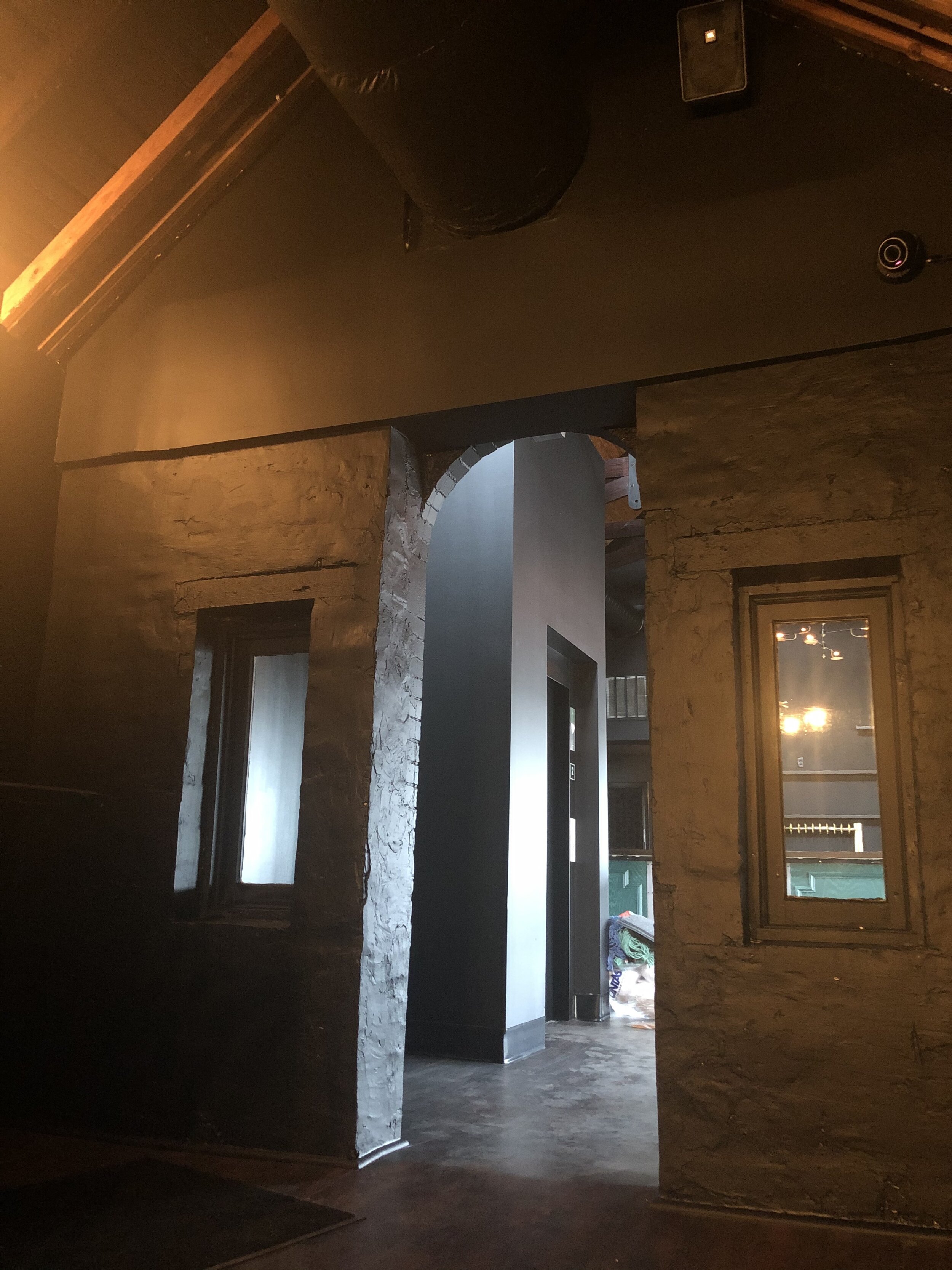
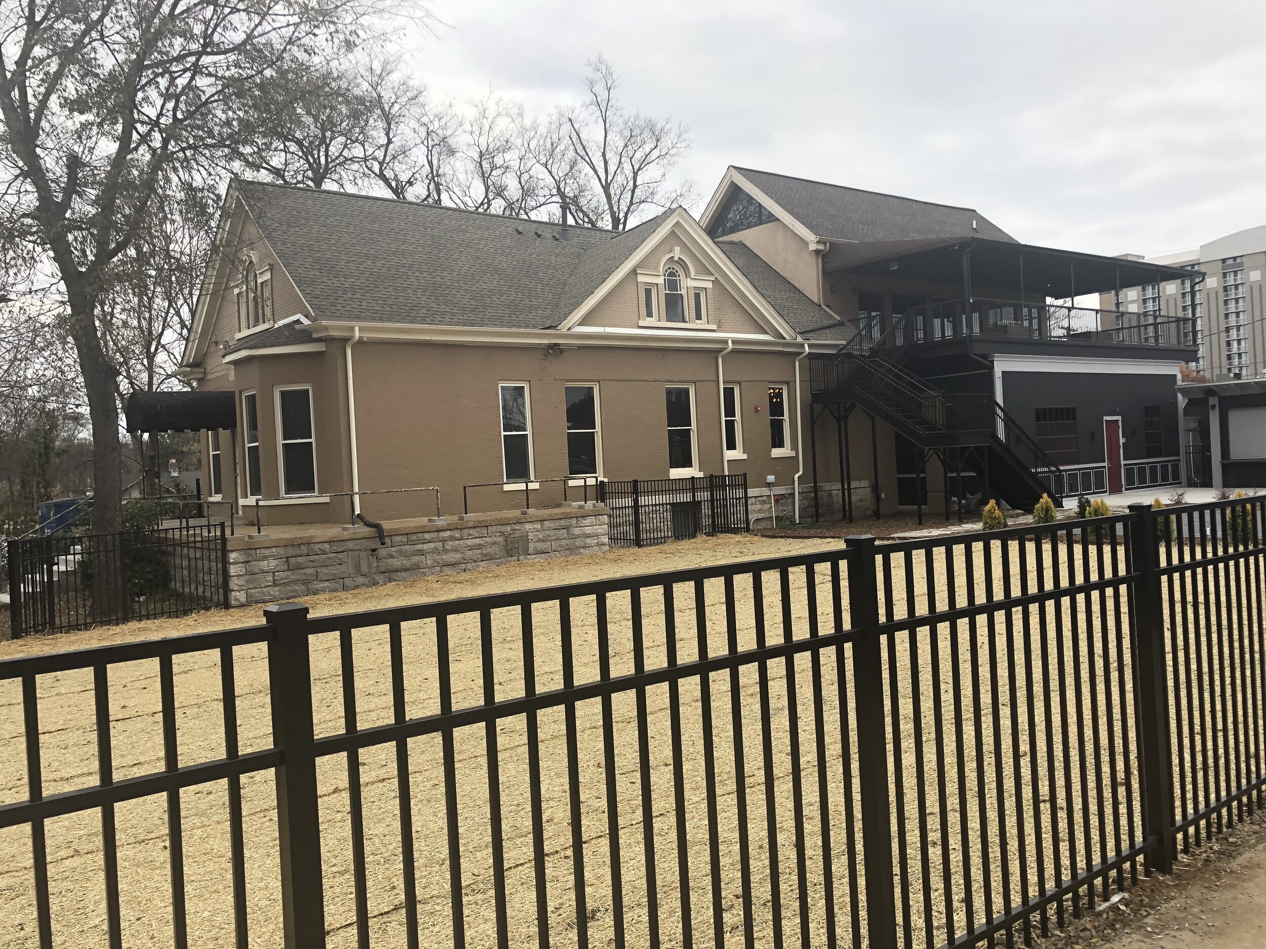
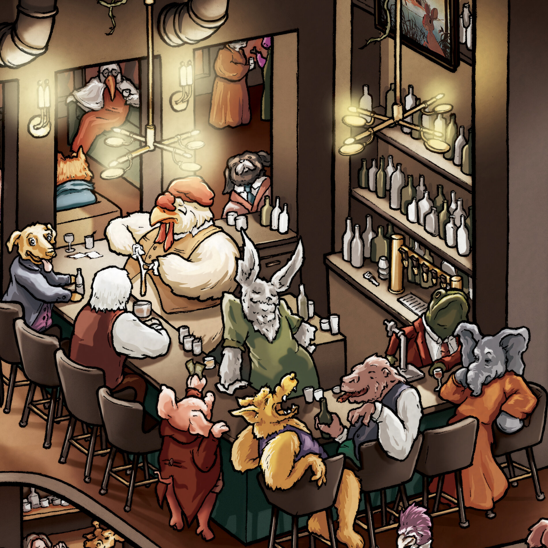
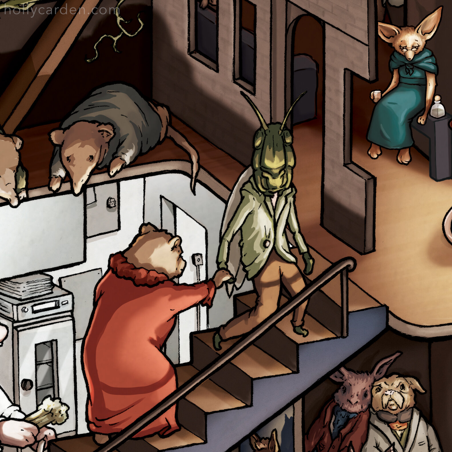
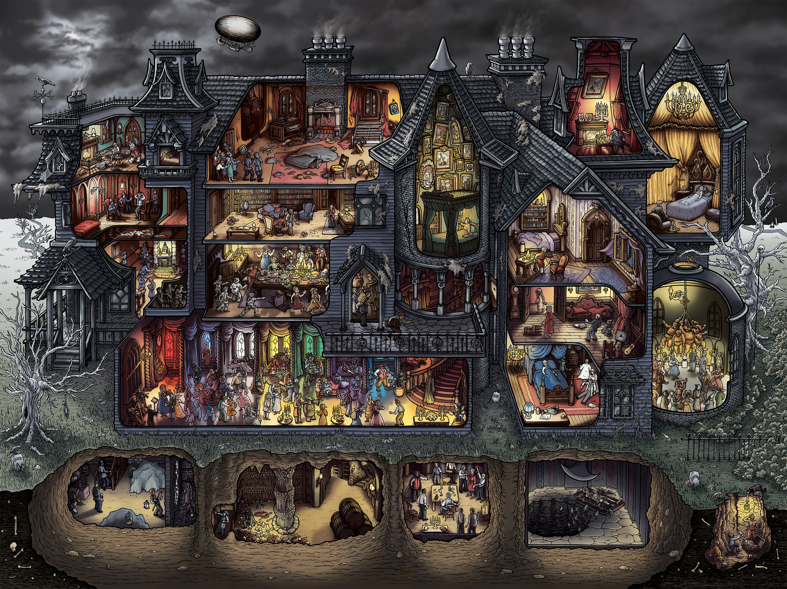
/Atop a terrific precipice among the mountains of Transylvania stands the formidable Bran Castle. Bram Stoker didn’t specify that Bran was the castle he wrote about in his 1897 novel Dracula. However, due to his description of the castle, its location, and the strange stories about its former blood-thirsty inhabitant Vlad the Impaler, Bran Castle is widely accepted as the home of notorious vampire Count Dracula.
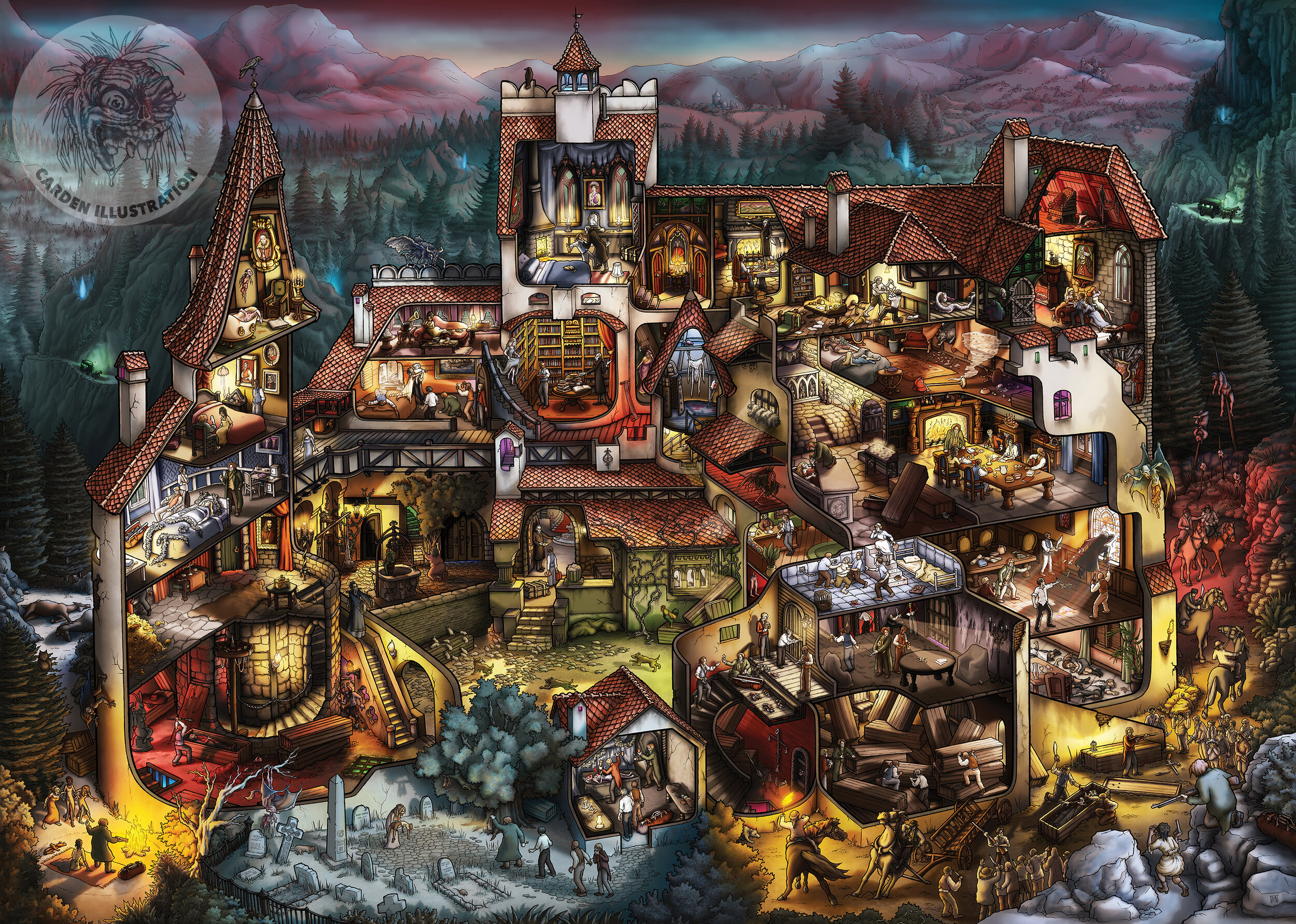
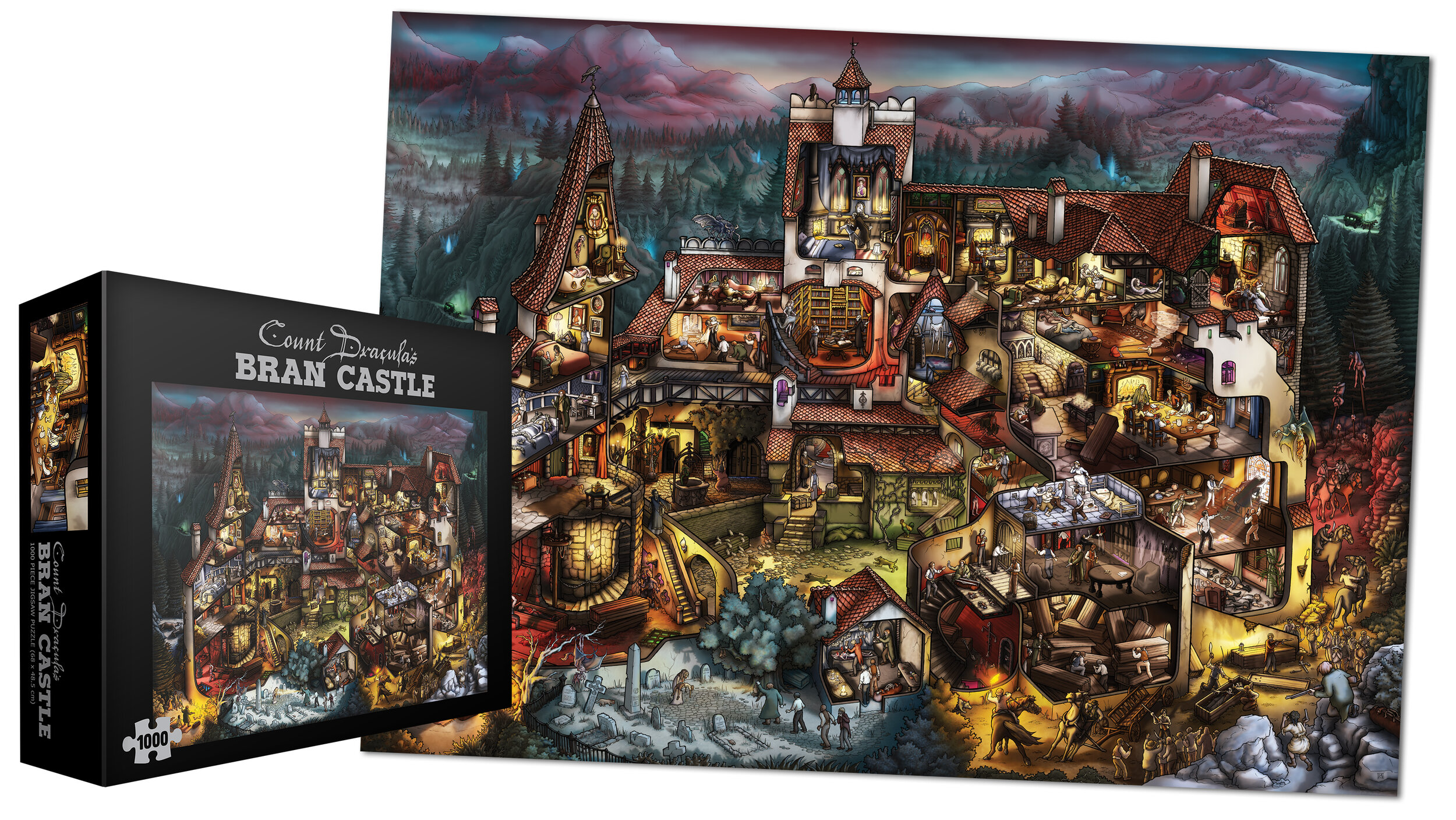
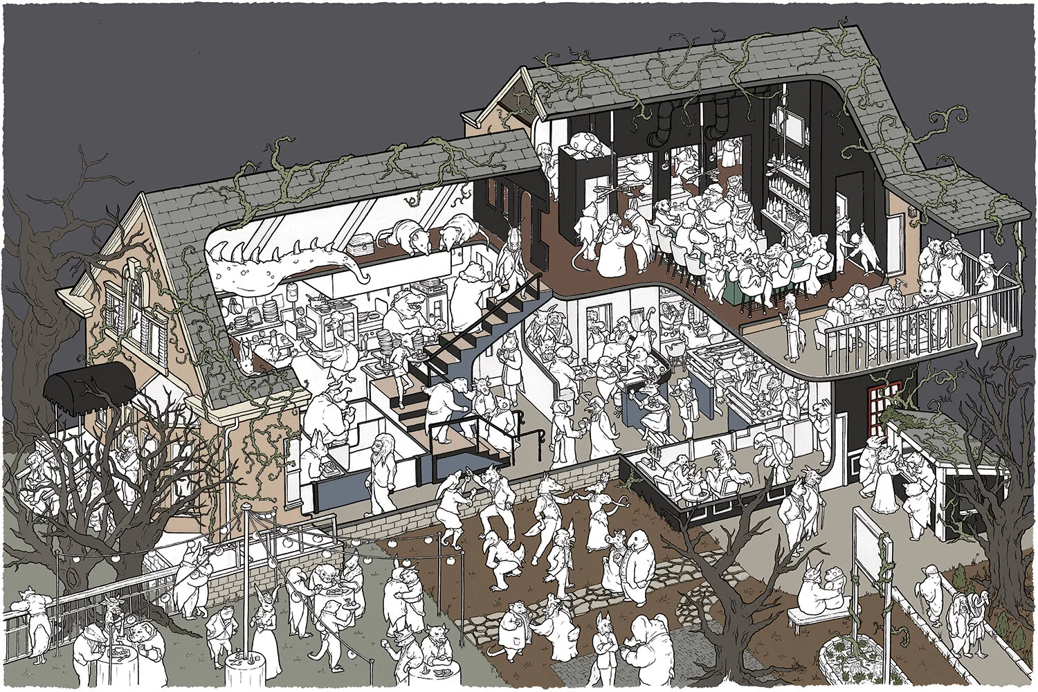
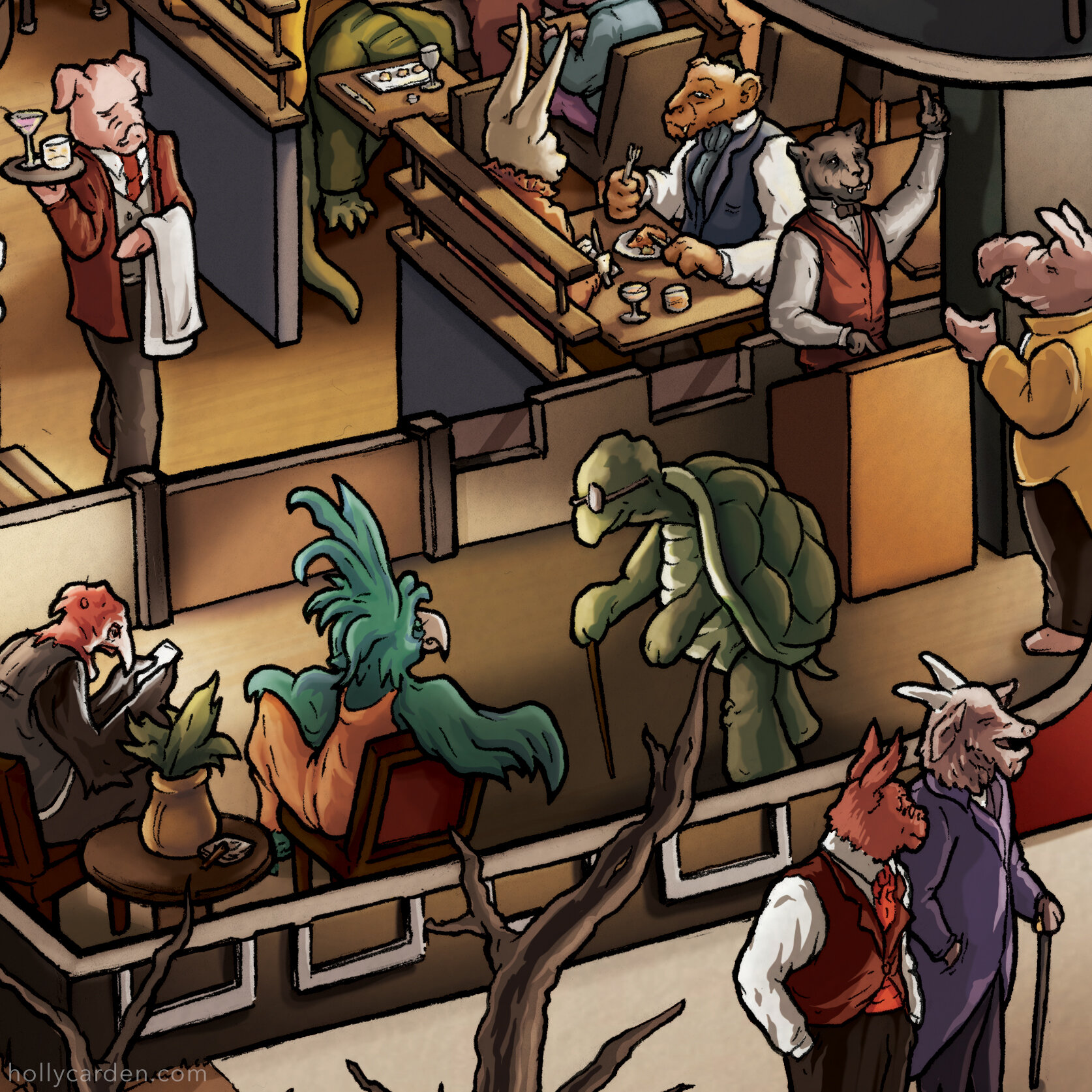
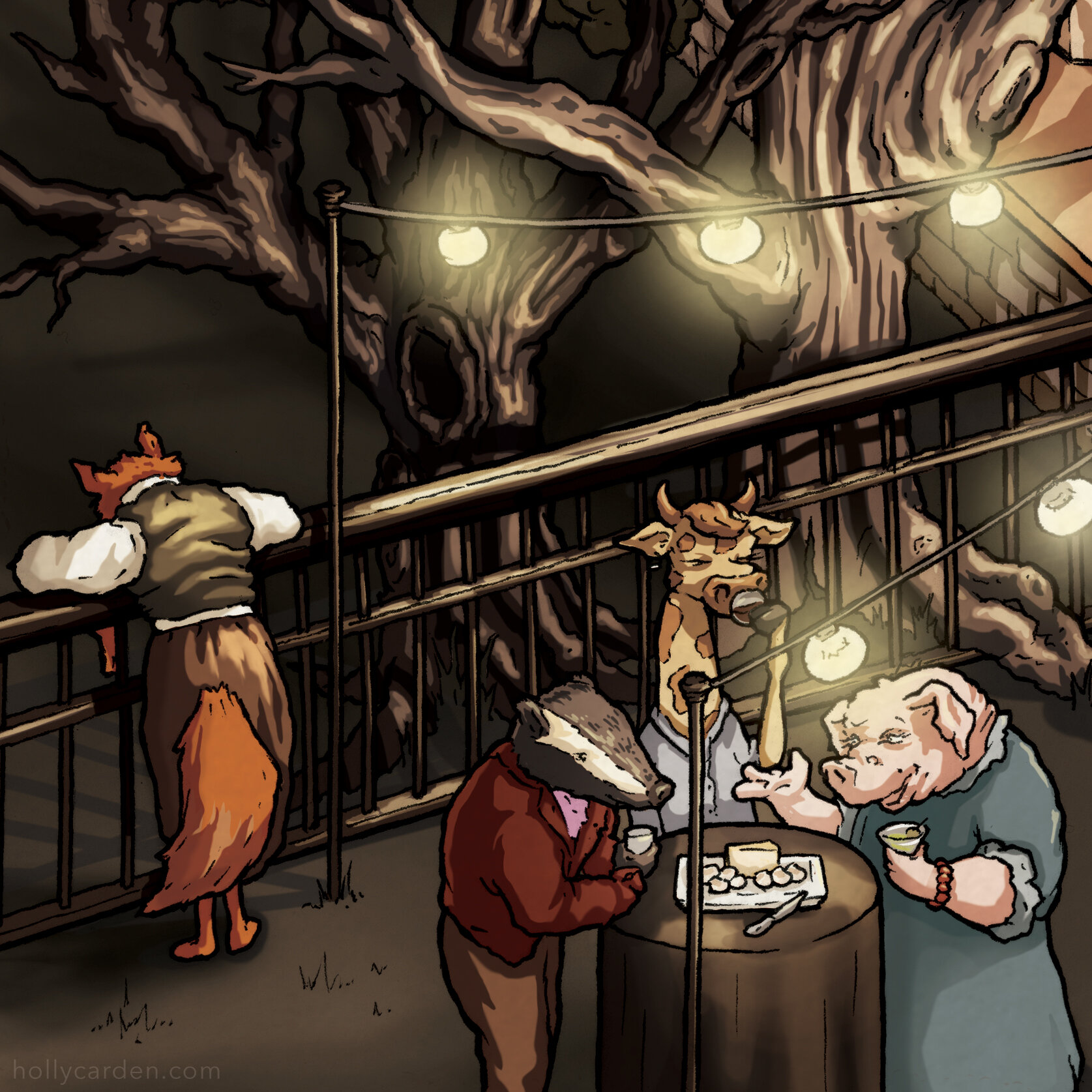
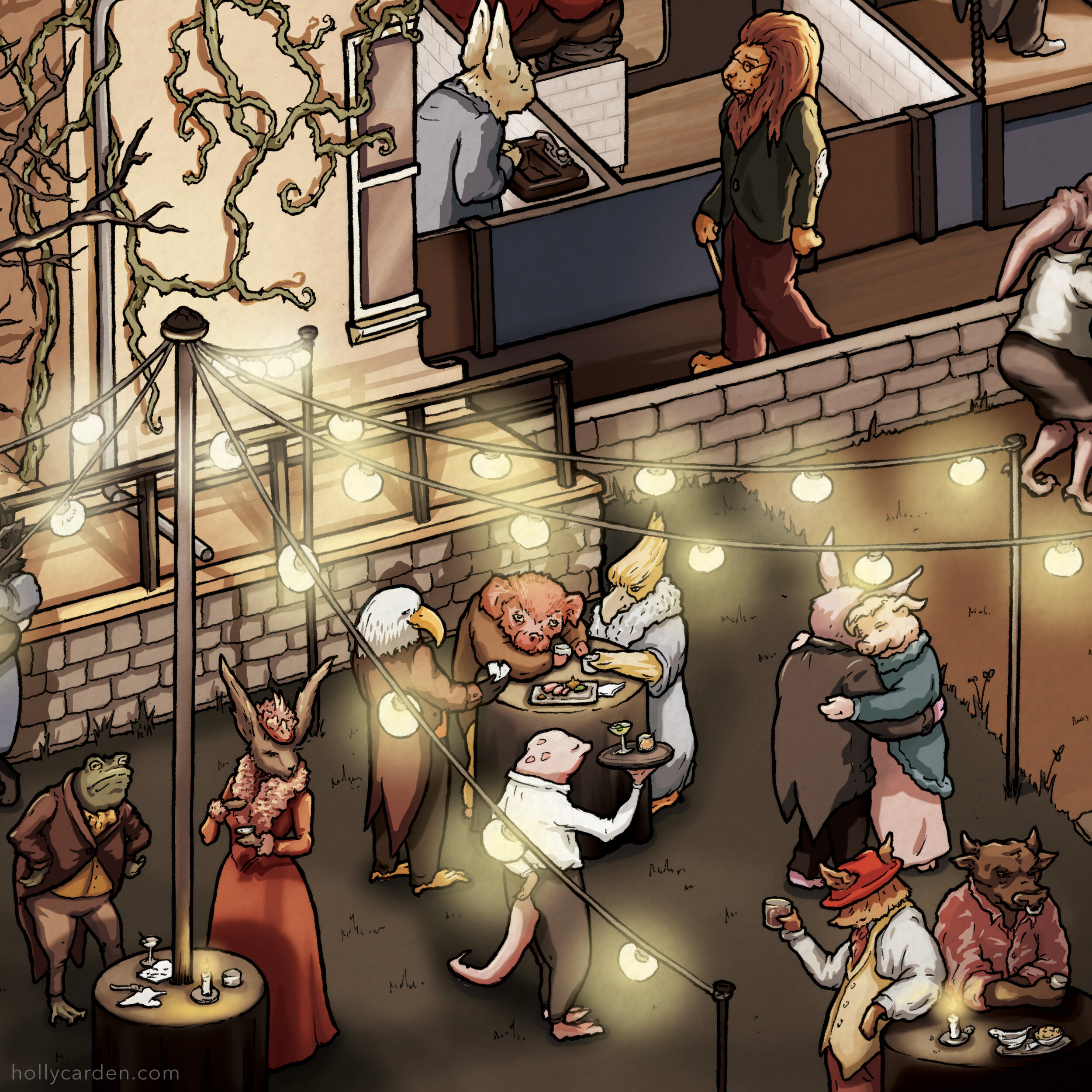
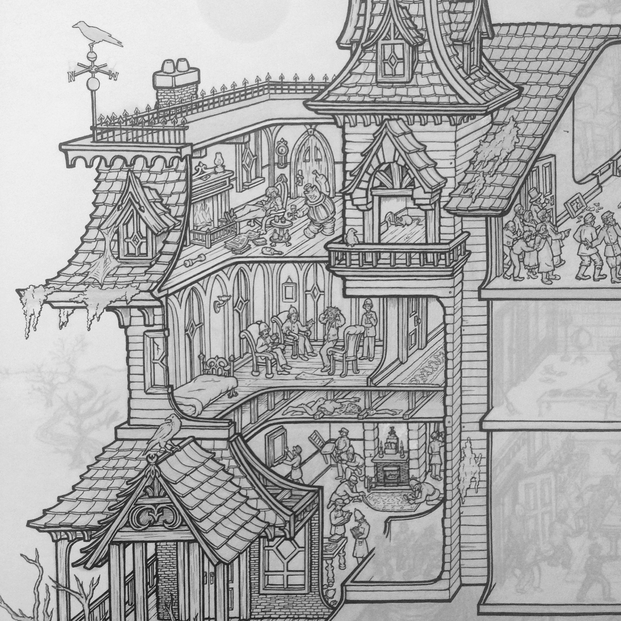
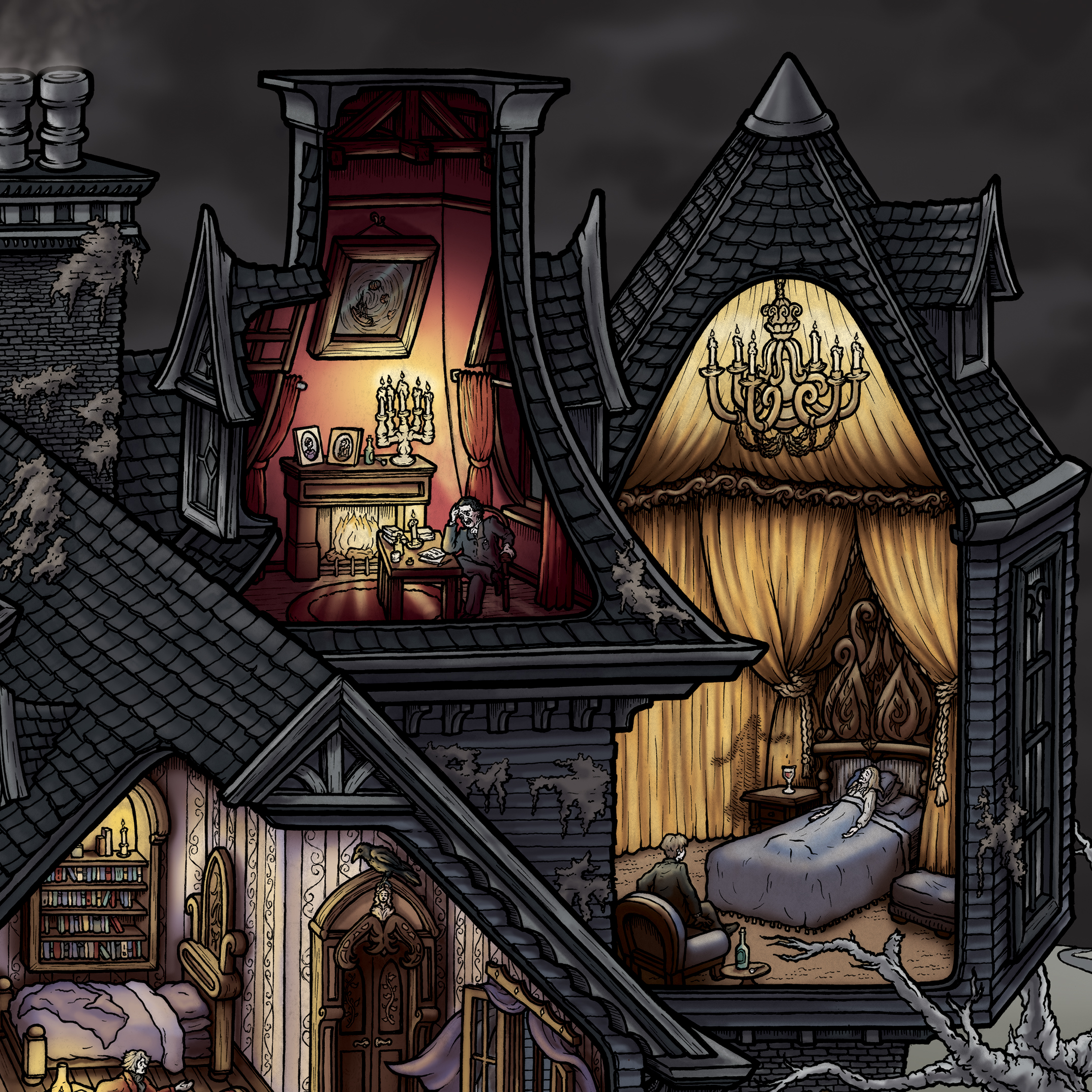
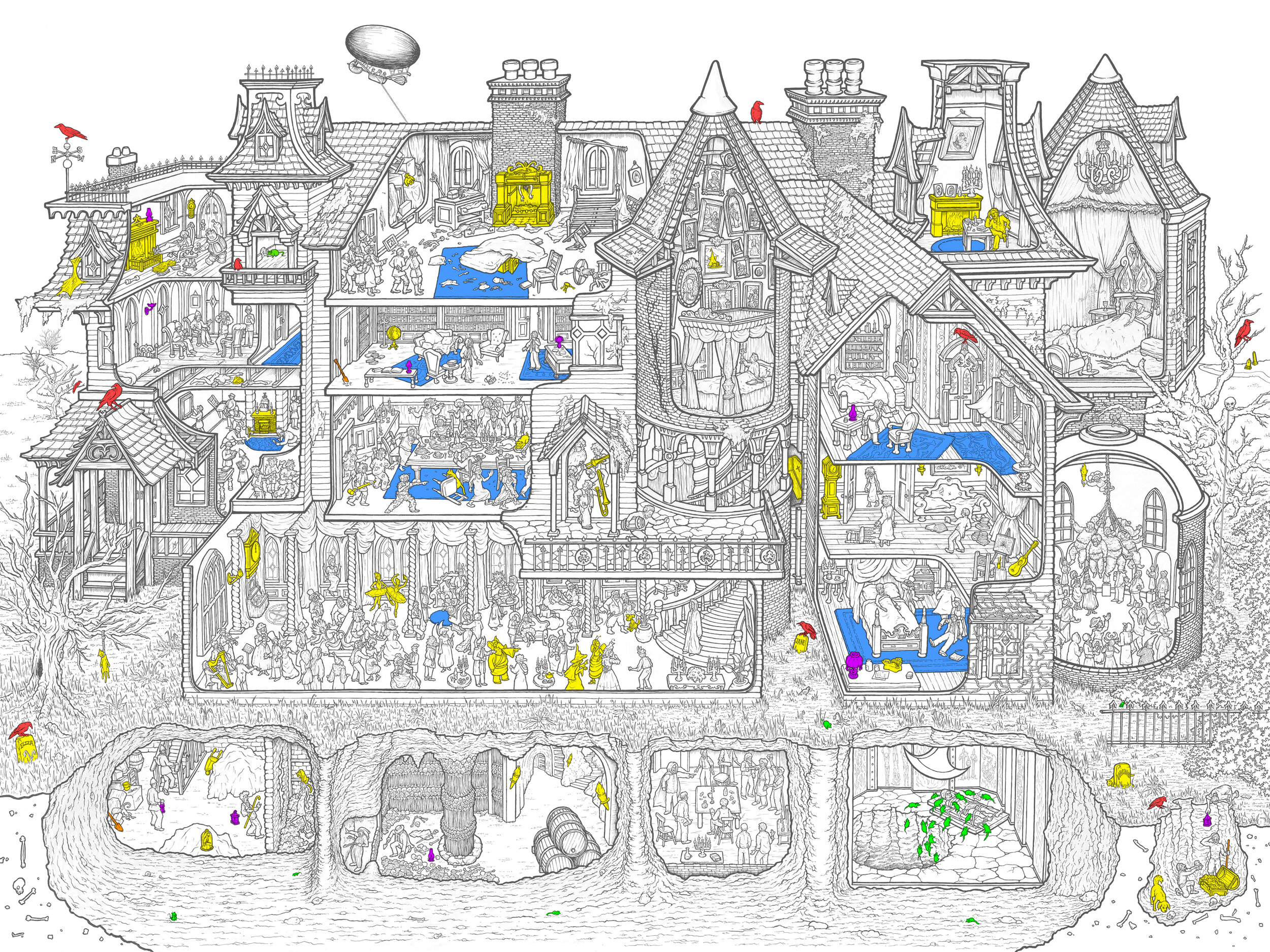
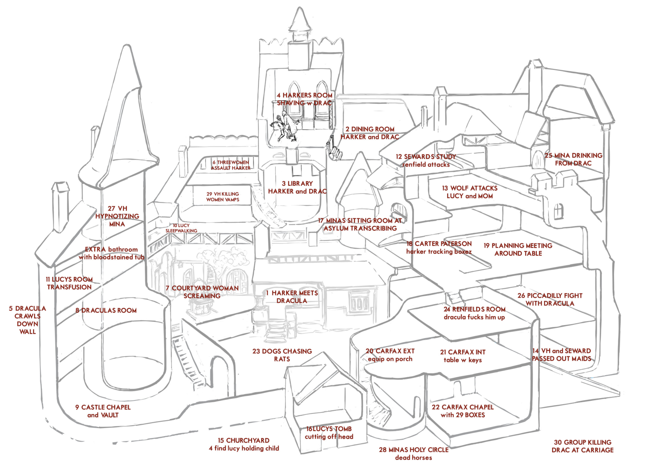
Stoker’s entire novel is told in 31 vignettes throughout the castle. You can fully immerse yourself in the story by listening to the audiobook while assembling, following the cast of characters around the 1000-piece puzzle (measures 19.1" x 26.8" assembled). The Stoker novel is not the only story told in this illustration. It is also packed with easter eggs and vampiric myths from all over the world. Inside the box you'll receive a vibrant 16.5" x 23.4" poster identifying them, as well as a seek-&-find game, and a legend labeling each scene from Dracula and the excerpt it illustrates.


This is the third in my line of jigsaw puzzles. The first two - H.H. Holmes' Murder Castle and Edgar Allan Poe's Macabre Mansion - have been hits, with thousands of copies shipped to 46 different countries. These puzzles are available in the store now. You can get the new Count Dracula’s Bran Castle puzzle by backing the Kickstarter here.


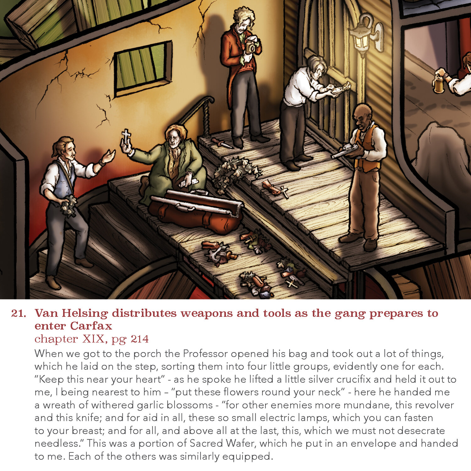
ILLUSTRATION PROCESS
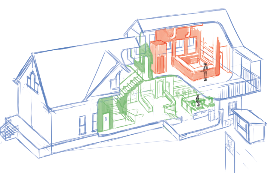
To make an elaborate cutaway drawing like this, I have a 6 step process.
1. Research For Dracula, this of course involved reading and listening to the novel many times. I hired my sister, Bethan - a very intelligent, super organized history buff - to help with the research and brainstorming. Between her extensive notes and reference image library, and my own studies of the book and architecture of the castle, we amassed a ton of resources from which to build the drawing. I then decided which scenes from the book to illustrate.


2. Super Rough This stage involves making some really important decisions, like the orientation of the building, which areas of the castle to cut away, and where in the picture to assign each of the 31 scenes.

3. Rough Sketch Once I’m happy with the structure of the building and the overall composition, it's time to fill it with stuff. This is when I decide which moment of each scene to illustrate. Composing each scene often requires adjustments in the room assignments or cutaway structure.
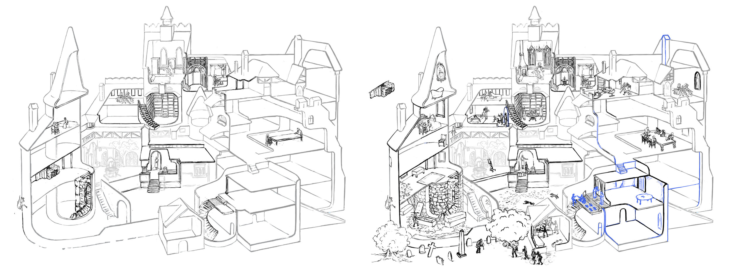
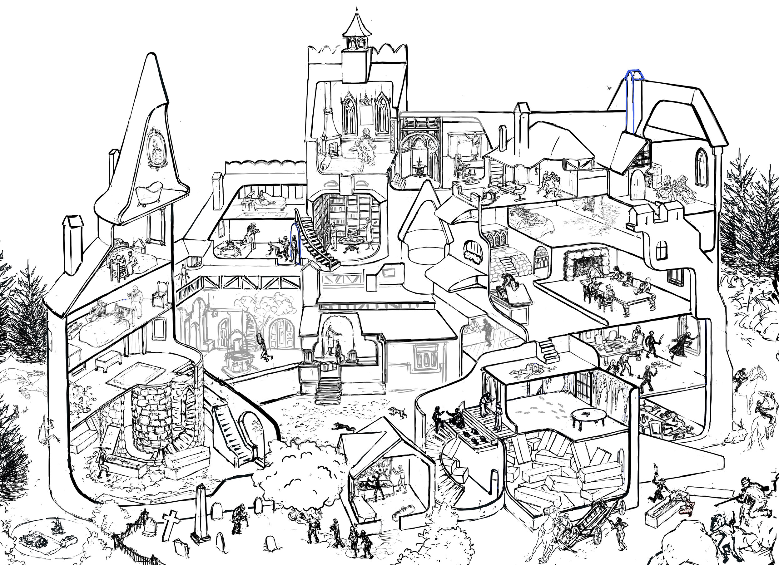
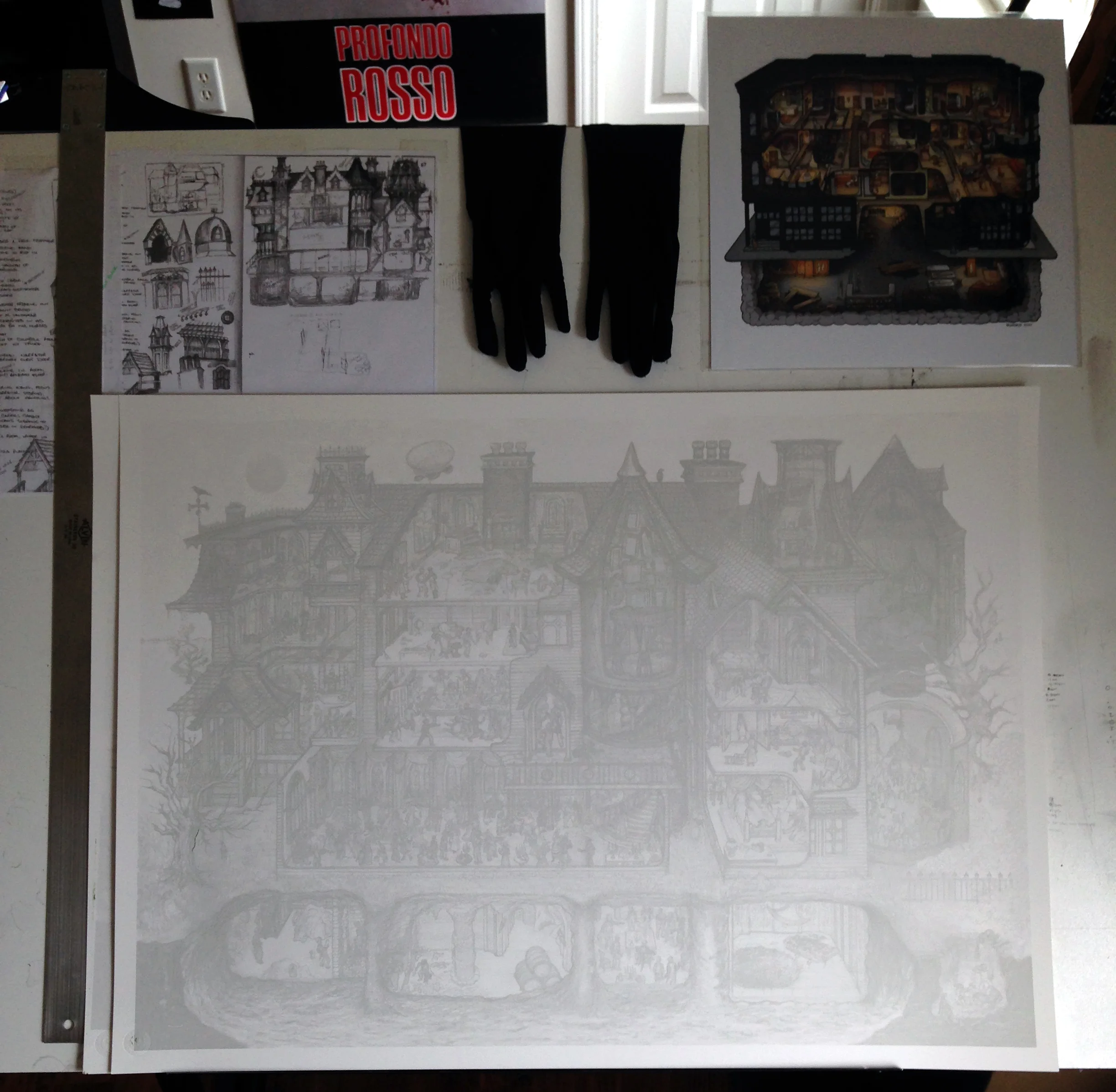
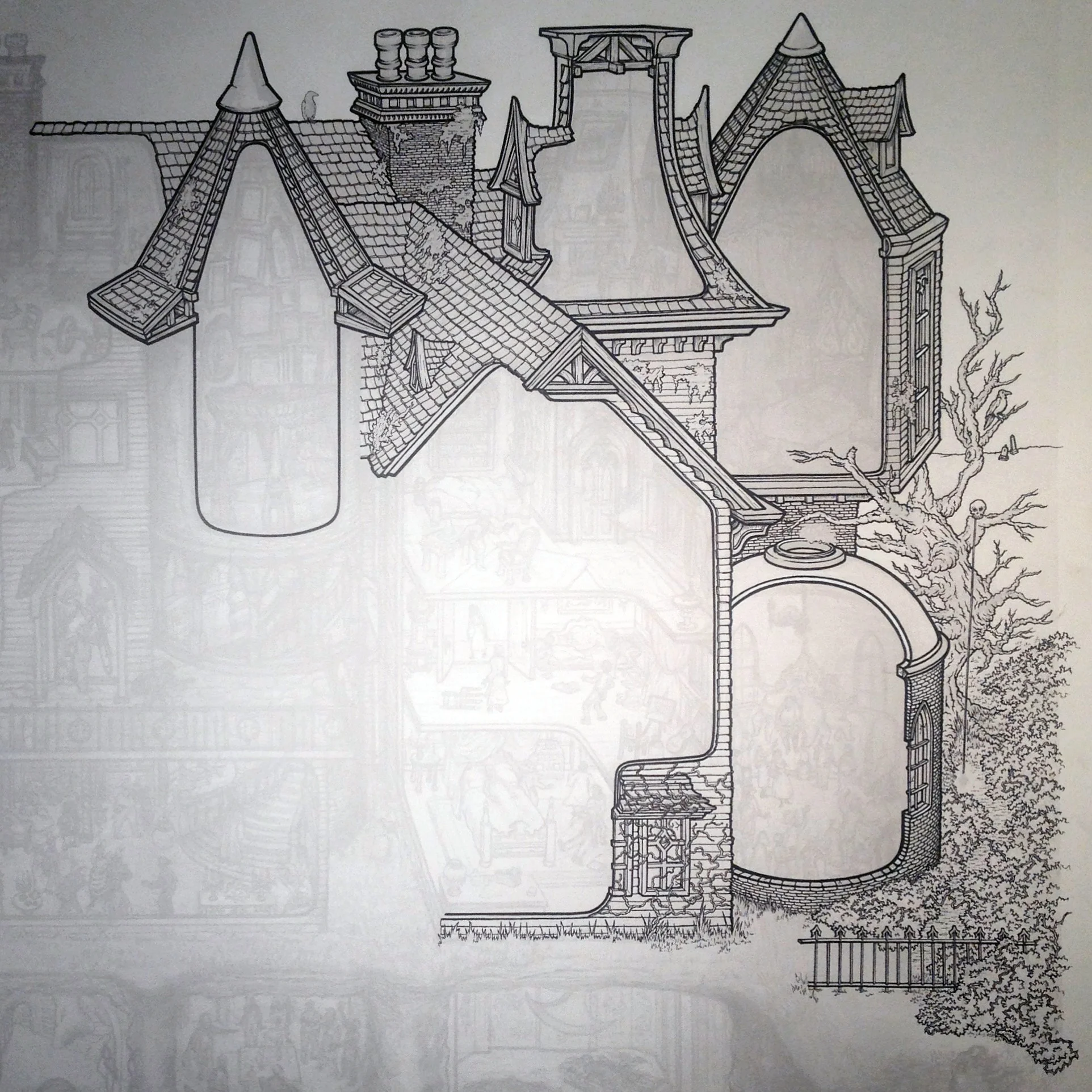
4. Tight Sketch The aim of the Tight Sketch is to define as much detail as possible and scour the research material for anything visual I can include. I want to get this draft as comprehensive as possible so that when I’m inking I can focus on the technical drawing aspect rather than stuff like design or facial expressions. It's also important to think ahead and include a variety of interesting light sources such as lamps, windows, and fireplaces.


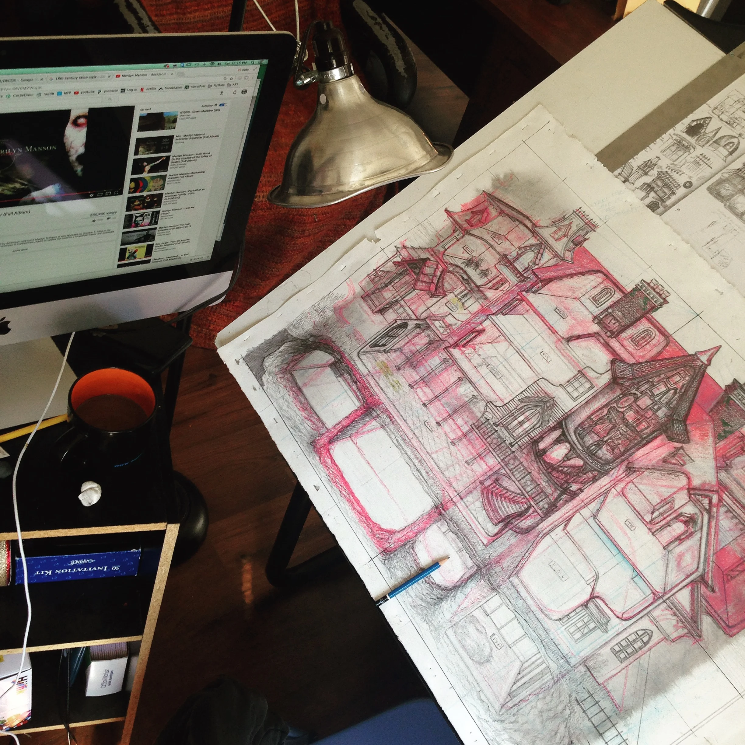
5. Ink Best part. I use 003 Micron liners and 0.05 Isograph by Rotring. I correct using a teeny tiny paint brush and Dr. Ph. Martin's white. The inking process for Dracula took about 120 hours. When the lines are down, I scan it on a kickass Epson at 600 DPI.


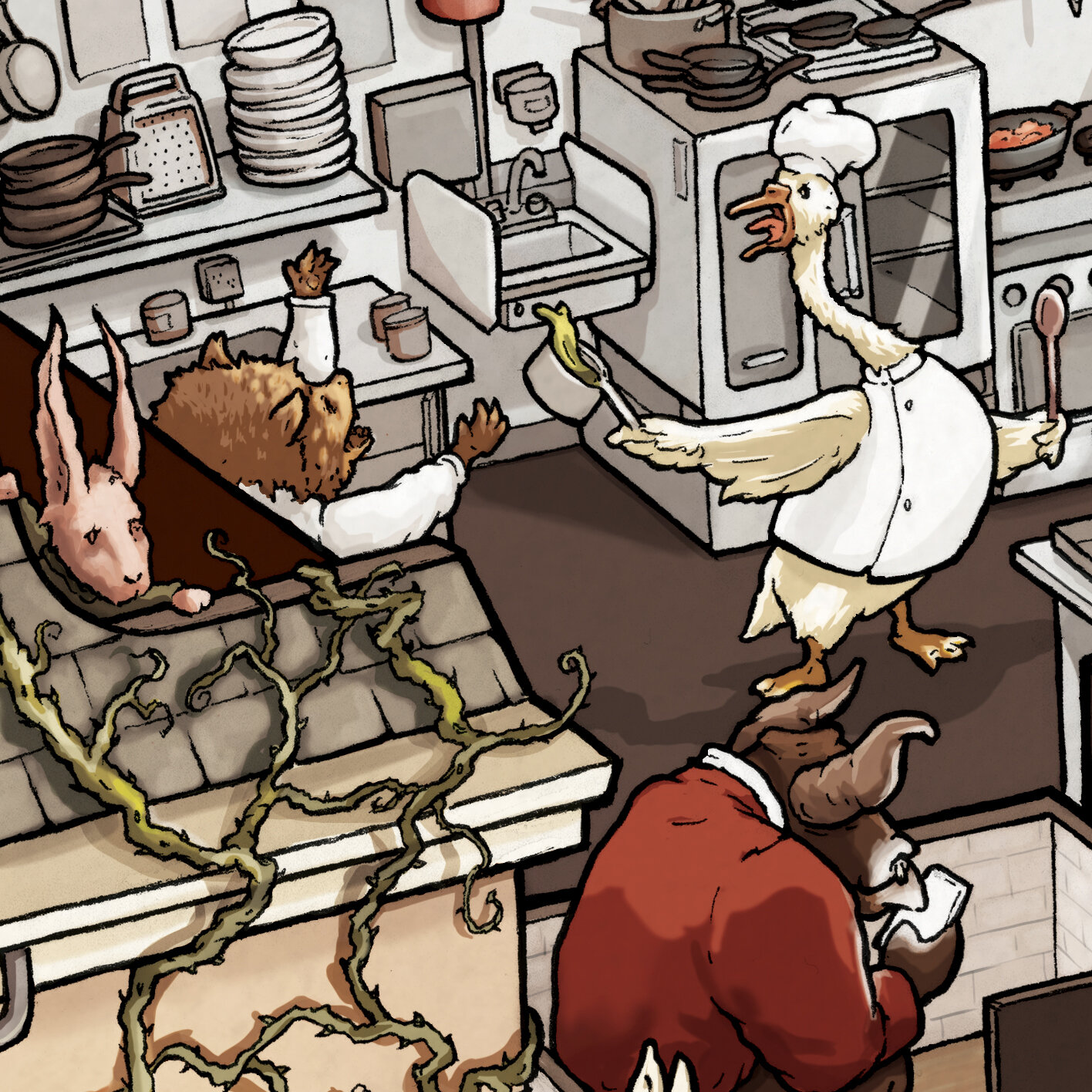
6. Color & Light After a little line cleanup in Photoshop, I’m ready for Color. There are actually three parts to my coloring process. First, the Flat Color, which involves choosing the palette and filling them in. Then Shading, which means adding dimension to the flat color and determining where the shadows will fall in relation to each of the light sources. The final part - and perhaps the most exciting - is turning on the lights. Adding vibrant, exaggerated color to illuminate everything gives the whole picture life.


EASTER EGGS AND STUFF
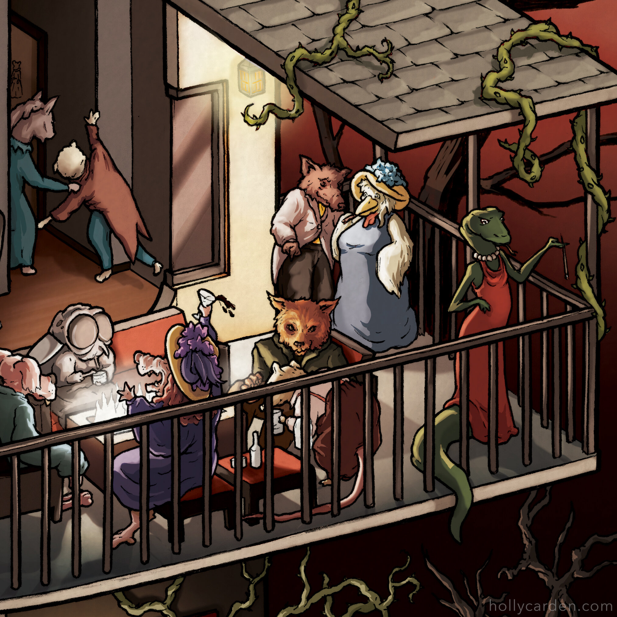
Hidden amongst the Dracula scenes are a bunch of mythic vampire characters from various countries. The puzzle comes with a poster identifying each of the monsters. However, the castle also contains lots of details and easter eggs not listed on the poster… Here they are! (Most of them, anyway... If you have any questions about what things mean, leave it in the comments below!)

Buffy the Vampire Slayer’s famous deadly scythe

Sesame Street’s lovable Count von Count is perched on the shelf in Dr. Seward’s study.
Wesley Snipes fans may recognize this: Blade’s glaive

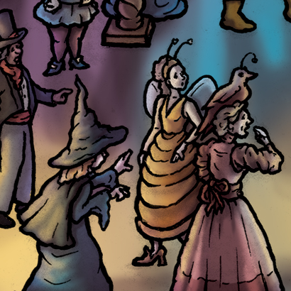
How could I leave out the most lovable vampires in the world. Here ARE Viago, Deacon and Vladislav from the hilarious 2014 film What We Do In The Shadows (which has since been turned into a great TV show on Hulu!)
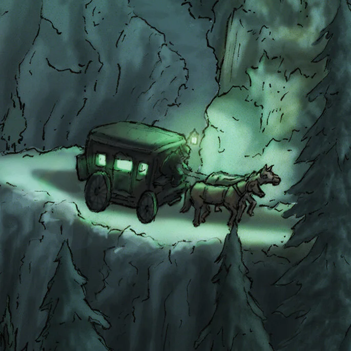
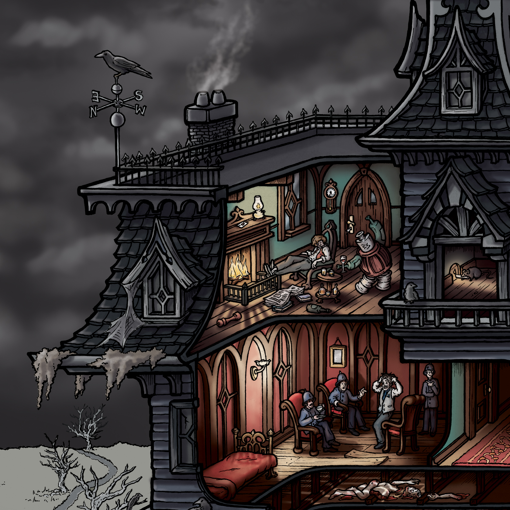
The first few pages of the novel describe Harker’s creepy carriage ride through the CarpathianS. You can see the carriage in The background, winding through the mountains.

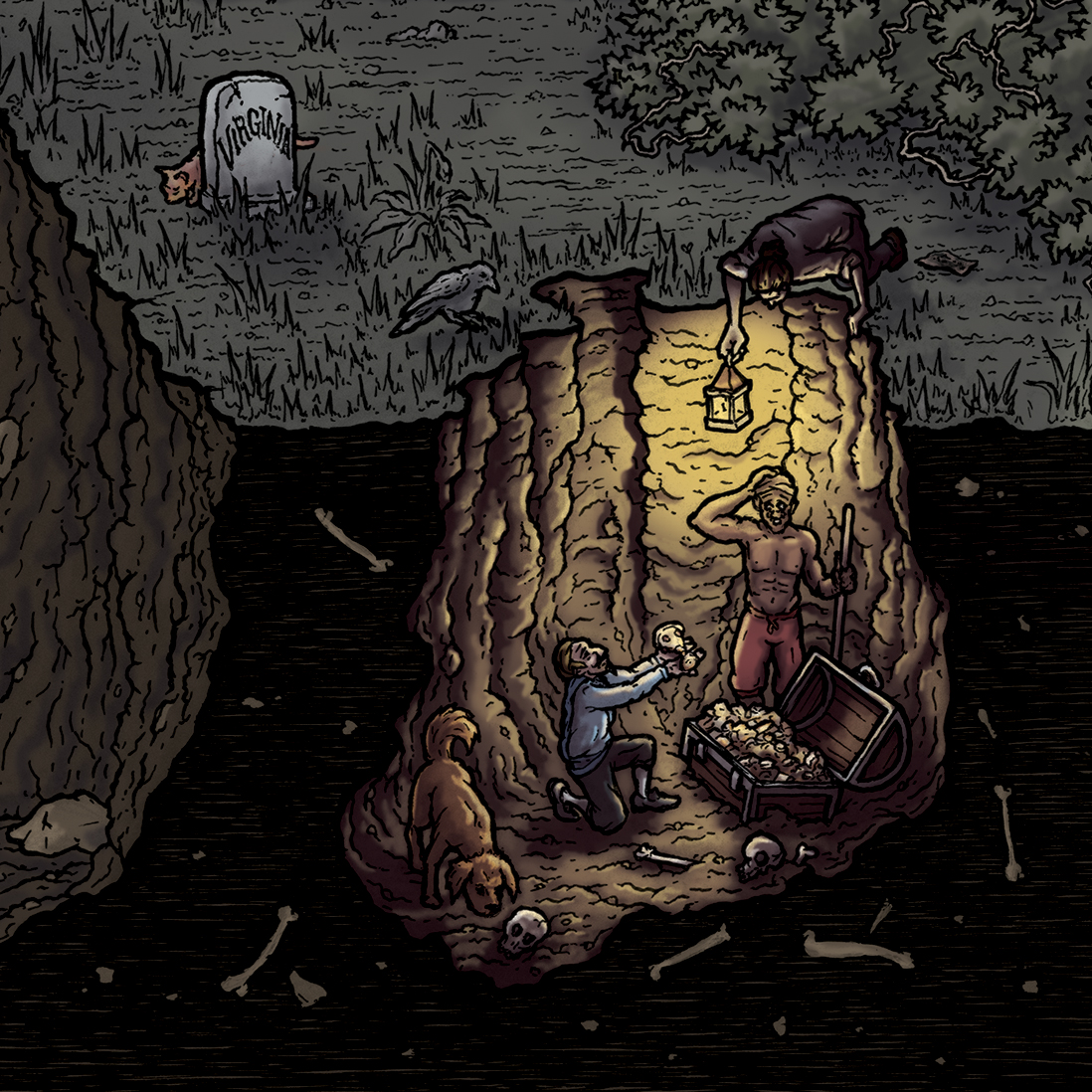
On his TREACHEROUS carriage ride, Harker describes eerie blue flames appearing in the mountains, and wolves howling. The mystery is only vaguely explained in the book, stating that thESE flames indicate Dracula’s hiding places for treasure.

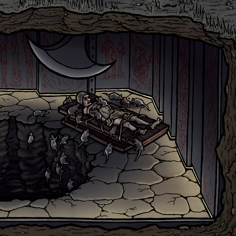
Vlad the Impaler was exiled and kept prisoner in Hungary for several years. During this time he apparently developed a rat impalement hobby. Crafty!

The O.V. - Nosferatu! This is the famous shadow he cast in the classic 1922 horror movie.

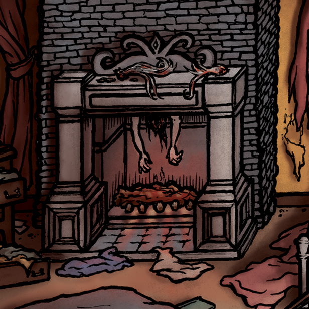
I asked my mom if there was anything she wanted me to hide in the picture for her. She said she’d had a weird dream the night before about a severed hand, so she told me to include that. Like mother like daughter! 💀

In the library scene, the novel describes an atlas on the table open to a map of england. Dracula had circled three areas where he intended to buy properties: London East Side, Exeter, and Whitby. It’s hard to see, but they’re in there!

Renfield told Dr. Van Helsing that Dracula had come to him in the form of big moths with a skull and cross-bones on their backs. Van Helsing identified these as “cherontia Aitetropos of the Sphinges—what you call the ‘Death’s-head Moth.”

On the shelf in Dr. Seward’s house there are some Psychiatry implements he may have used in his asylum. Here are his lobotomy tools and shock treatment HEADGEAR.

This stained glass window features one of the four instances of the Order of the Dragon symbol hidden throughout the castle.

Another Order of the Dragon emblem; this one is sculpted into the end of the vampiress’ tomb.
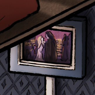
This is a scene from the 1994 film Interview with a Vampire. It depicts Armand performing “Danse Macabre”, or “Dance of Death”, a morbid traditional dance of the late middle ages wherein death summons humans from all walks of life.

One of the documents in the novel is a newspaper article in the Whitby Gazette called “The Hampstead Horror”, referring to the “Bloofer Lady” and missing children.
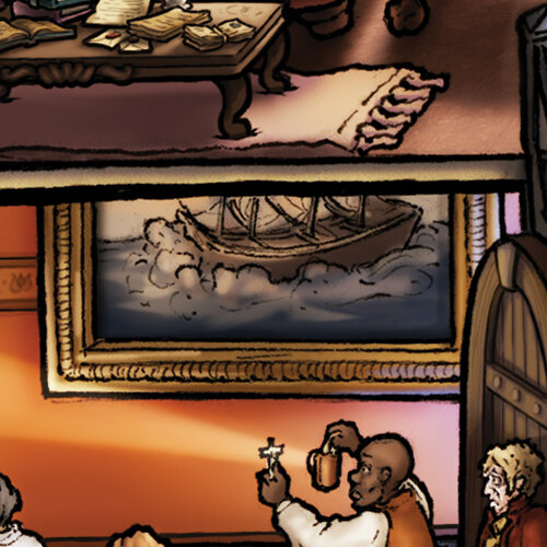
Dracula and his boxes of earth travel to England on a mysterious ship, which naturally has a pretty tumultuous journey.

One of the best character costumes ever, Gary Oldman as old Dracula from The Coppola movie.

As I was adding the finishing touches to the drawing I became aware of lady dimitrescu, a big awesome vampire woman from the video game Resident Evil Village. I thought it only appropriate to include her signature hat and corsage. The baphomet statue is just for me.
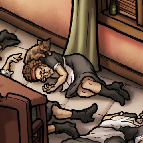
Back when I released Edgar Allan Poe’s Macabre Mansion, I ran a contest. Whoever could find the clue in the Poe picture and guess the subject of the next puzzle would be drawn into the new illustration. Tara Schnaible correctly guessed Dracula/Vlad the Impaler because hidden in the Poe house was a dracula-style coffin and impalements etched into the walls of the dungeon. Here she is with her kitty being a passed out maid.

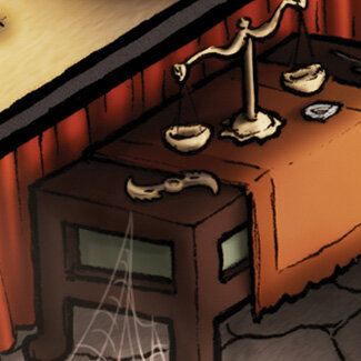
This Iron Maiden and bigass saw are some of the many torture devices on display at Bran Castle.

This chair is also on display in the Bran Castle torture museum. Juicy!

This sword display is on the wall at Bran Castle. The coat of arms is drawn from the armor worn by young Dracula in Francis Ford Coppola’s Bram Stoker’s Dracula. Yet another incredible movie costume. I think that movie got best makeup or something at the Oscars.

The grossest torture device in the Bran Castle museum is the Breaking Wheel. Basically its purpose was to mangle and break all your bones. Super messed up.

ALBRECHT DÜRER This is a portrait of Albrecht Dürer, a German painter and printmaker whose work was a prominent part of the Northern Renaissance, and a significant influence of mine. His self-portrait was used as a model for the portrait of young Dracula featured in Coppola’s 1992 film Bram Stoker’s Dracula starring Gary Oldman.

This is Dürer’s self-portrait, painted in the year 1500.

Here is the portrait used in the movie Dracula.
Coincidentally, a massive Dürer etching exhibition came to the Frist Art Museum here in Nashville right before I was about to start inking the castle. I visited the exhibit twice and spent a lot of time studying his fine linework and incredible background details.

Here is a background from one of etchings I studied at the exhibit.

…and this is my attempt at the scene, drawn while standing right in front of an incredible original print! You’ll notice similar castles in the background of the Bran Castle illustration.
Dürer signed all of this work with this little emblem, so in honor of his weird connections to this drawing, I signed my initials in the same style.

here is Dürer’s signature, which he often incorporated into the drawing.
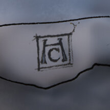
Here’s mine (it’s in the bottom right corner…)
Also, note the cane leaning against the door beneath the Dürer portrait. This cane belongs to Barnabas Collins, the lead character in the classic vampire TV show Dark Shadows which originally aired 1966-1971. It has since been remade, with Johnny Depp starring as Barnabas.
THE GLOBAL VAMPIRIC CONSORTIUM This is the bottom of the illustrated guide that comes with the puzzle. Needless to say I learned a lot about vampires of all shapes and sizes! You can see these at a higher resolution on my Instagram feed.

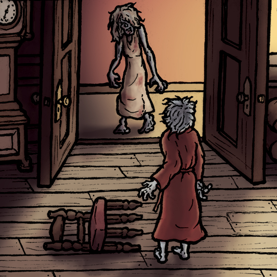
THE GRAVEYARD One of the more unsettling scenes in Dracula is when the gang discovered a vamped out Lucy in the graveyard holding a tiny victim. I used these graves to memorialize the various historical figures associated with Bran Castle, as well as some of the unfortunate souls who passed away in the novel.
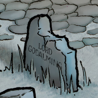
Arthur’s father, Lord Godalming, passes away around the middle of the book. Arthur then becomes the new Lord Godalming (and is confusingly referred to as both names throughout the rest of the novel.)

Lucy’s mother, Mrs. Westenra, tragically dies when a wolf jumps through their window in the night and attacks them. This was, of course, Dracula in one of his many animal disguises.

Mr. Hawkins was Jonathan Harker’s employer, who left the business and his fortune to Harker upon his death.

King Louis I of Anjou granted the city of Brasov permission to build Bran Castle.

Bran Castle was given to Prince Mircea the Elder of Wallachia in return for his loyalty. He used it as a refuge in the event of an attack from the Turks. (That appears to have happened a lot.)

Bran Castle’s most notorious resident, Vlad The Impaler, is also pictured in a portrait on one of the castle walls. His grisly impalement torture can also be found in a couple of scenes…

The citizens of Brasov gifted Bran Castle to Queen Marie of Romania in 1920. It became her favorite residence. (The engraving is the emblem of The Order of The Dragon, which is hidden in three other places throughout the castle.)

When Queen Marie died, she bequeathed Bran Castle to Princess Ileana. During the war, she converted the castle into a hospital to serve Brasov soldiers injured in American bombings. Princess Ileana personally nursed patients there until 1948.

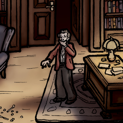
Mr. Swales is an old curmudgeon who befriends Mina and Lucy. He goes on a big long rant about how phrases like “Sacred To The memory” and “Here Lies The Body” on gravestones is bullshit because no one liked those people anyway, and their graves are probably empty because they’re lost at sea. Charming! He was mysteriously found dead shortly after.

This stone cross is actually standing at the rear of Bran Castle. It is engraved with creepy runes and is said to mark the spot where Queen Marie’s heart was buried.

Creepy!
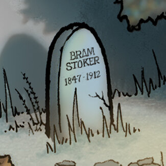
And, of course, The acclaimed author of the novel Dracula is at rest in the graveyard he imagined. I hope he would have liked my drawing.