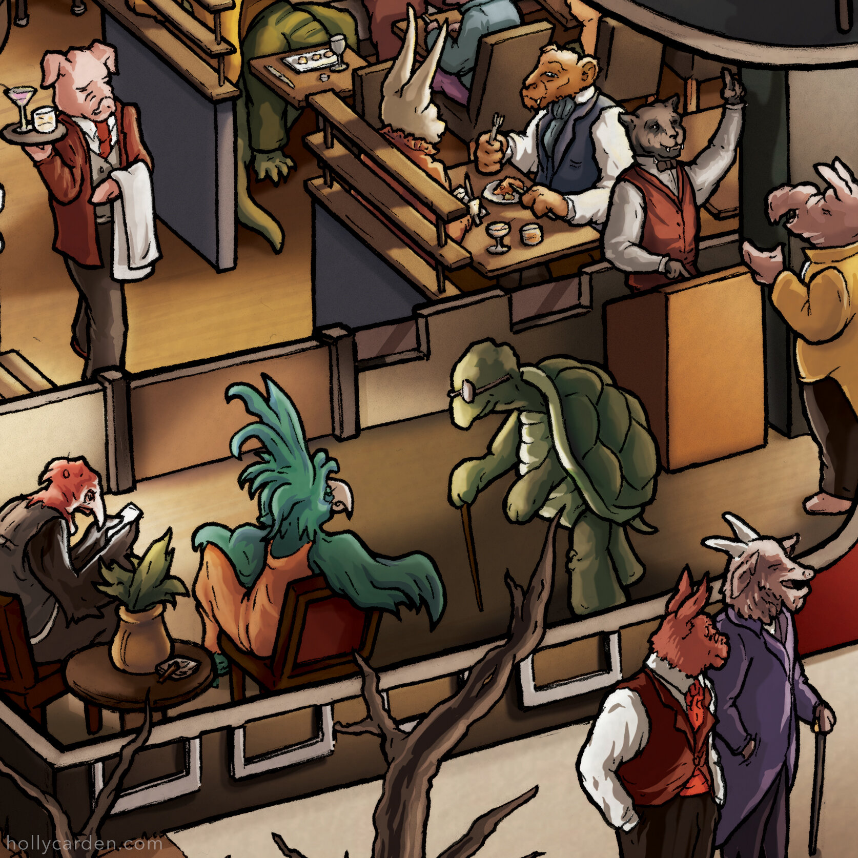
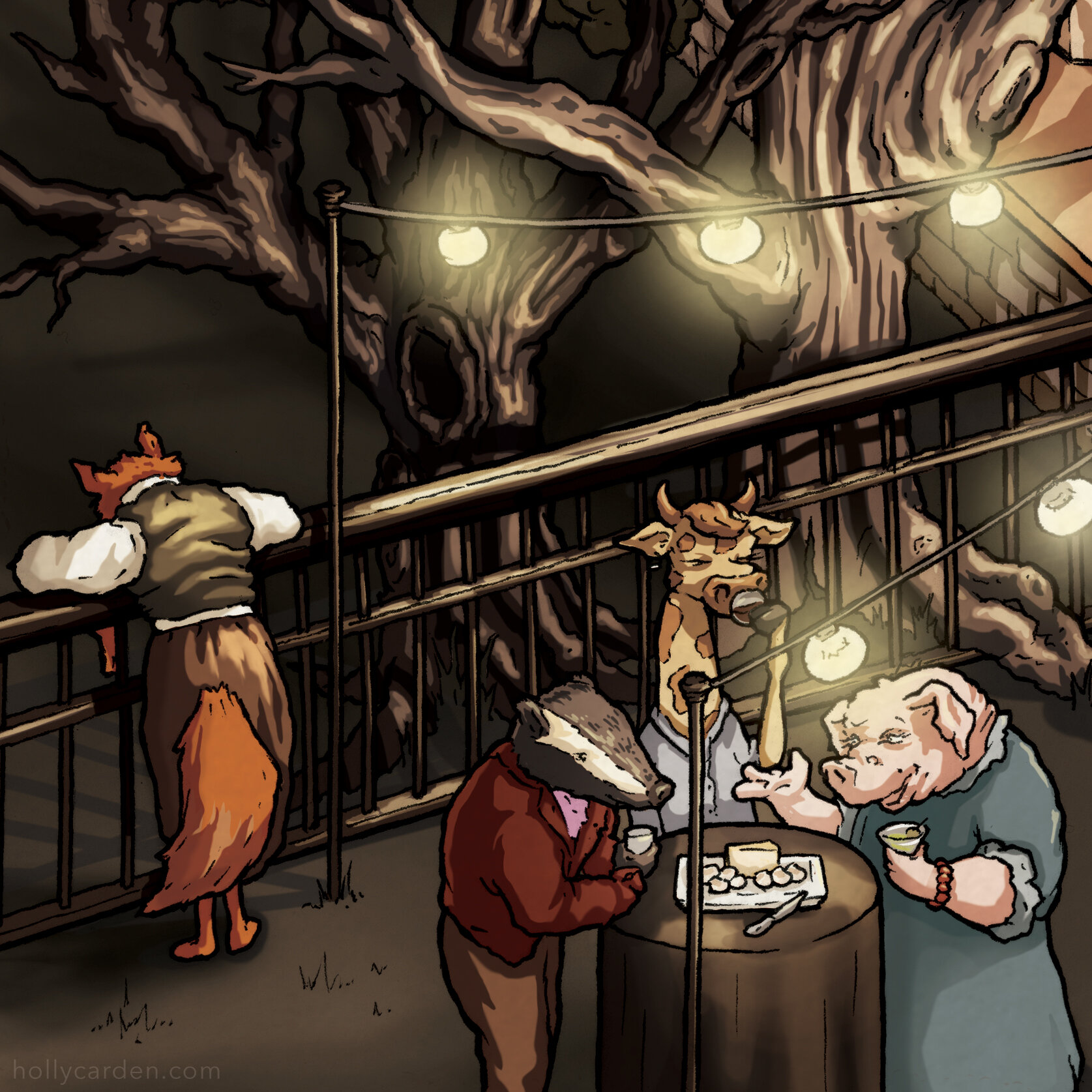
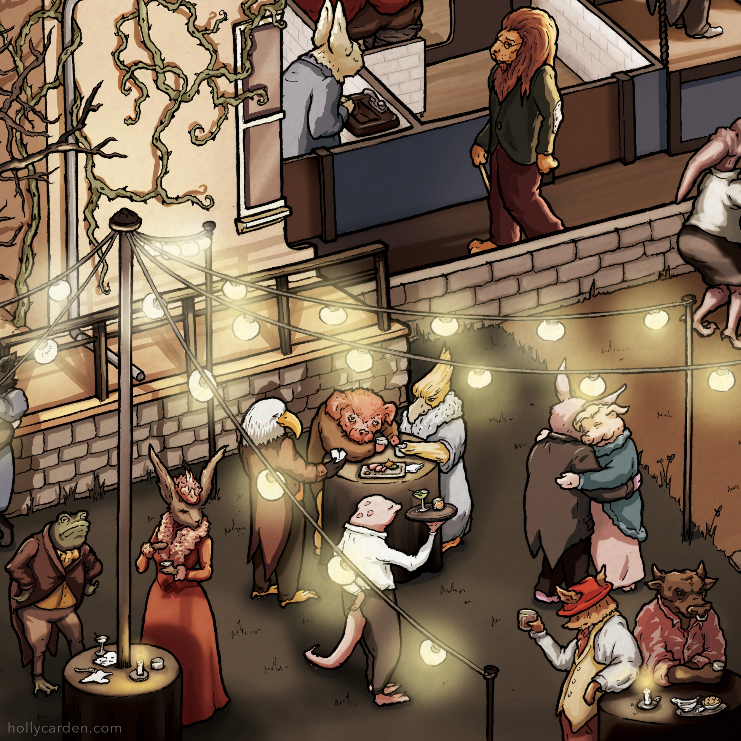
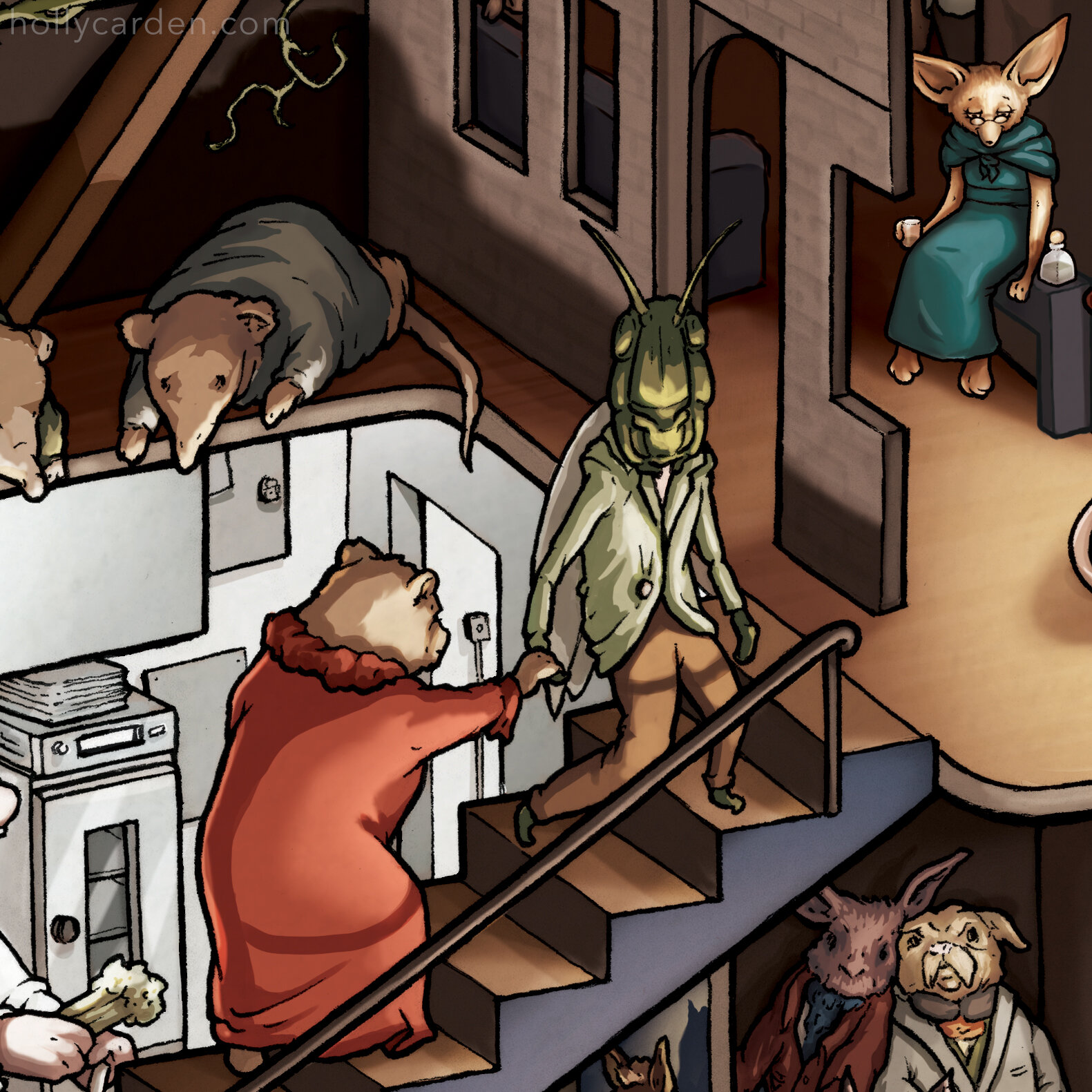
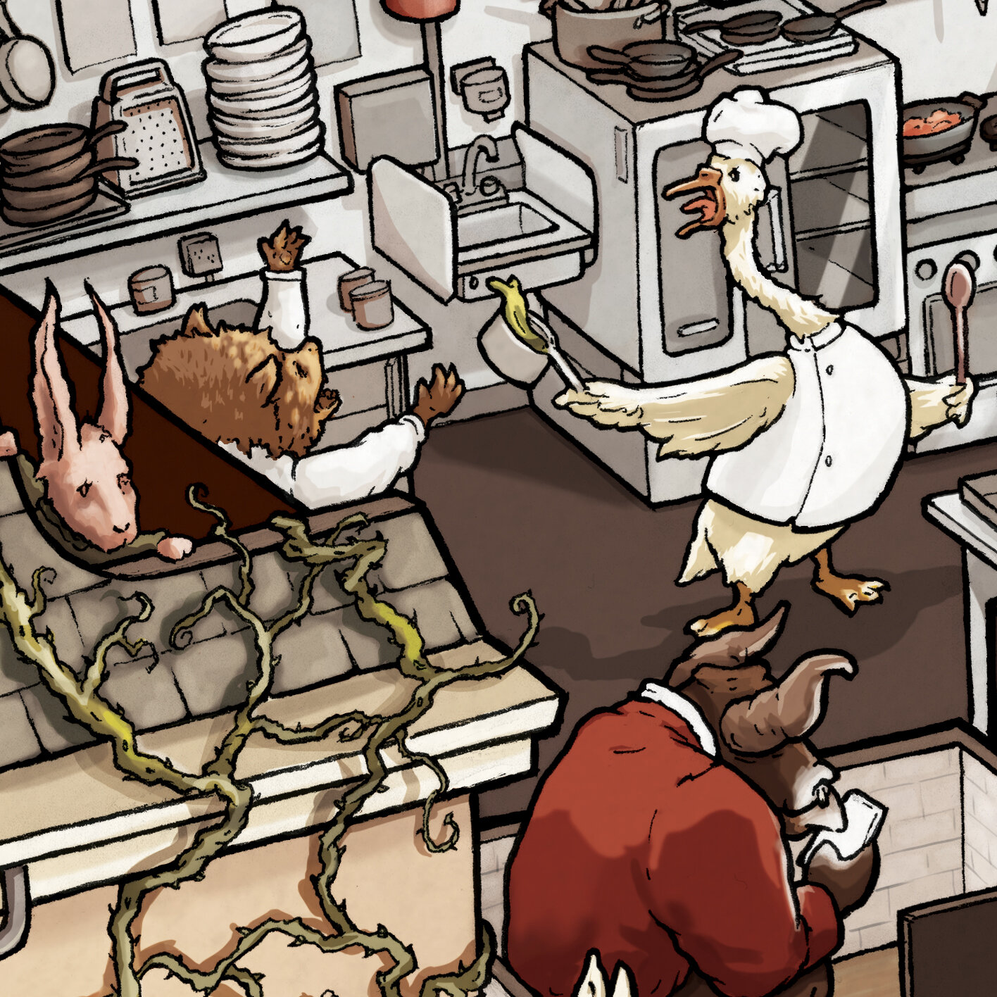
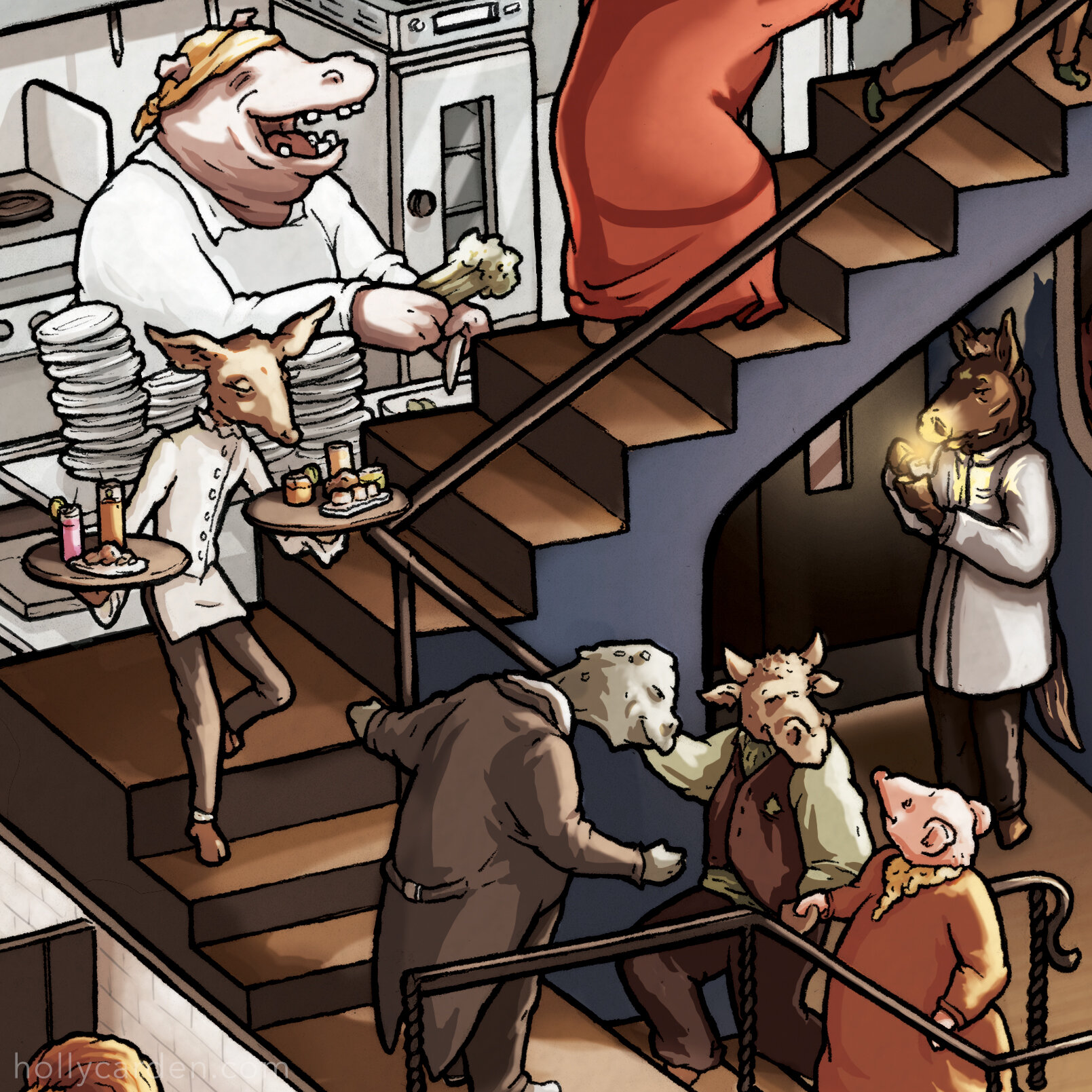
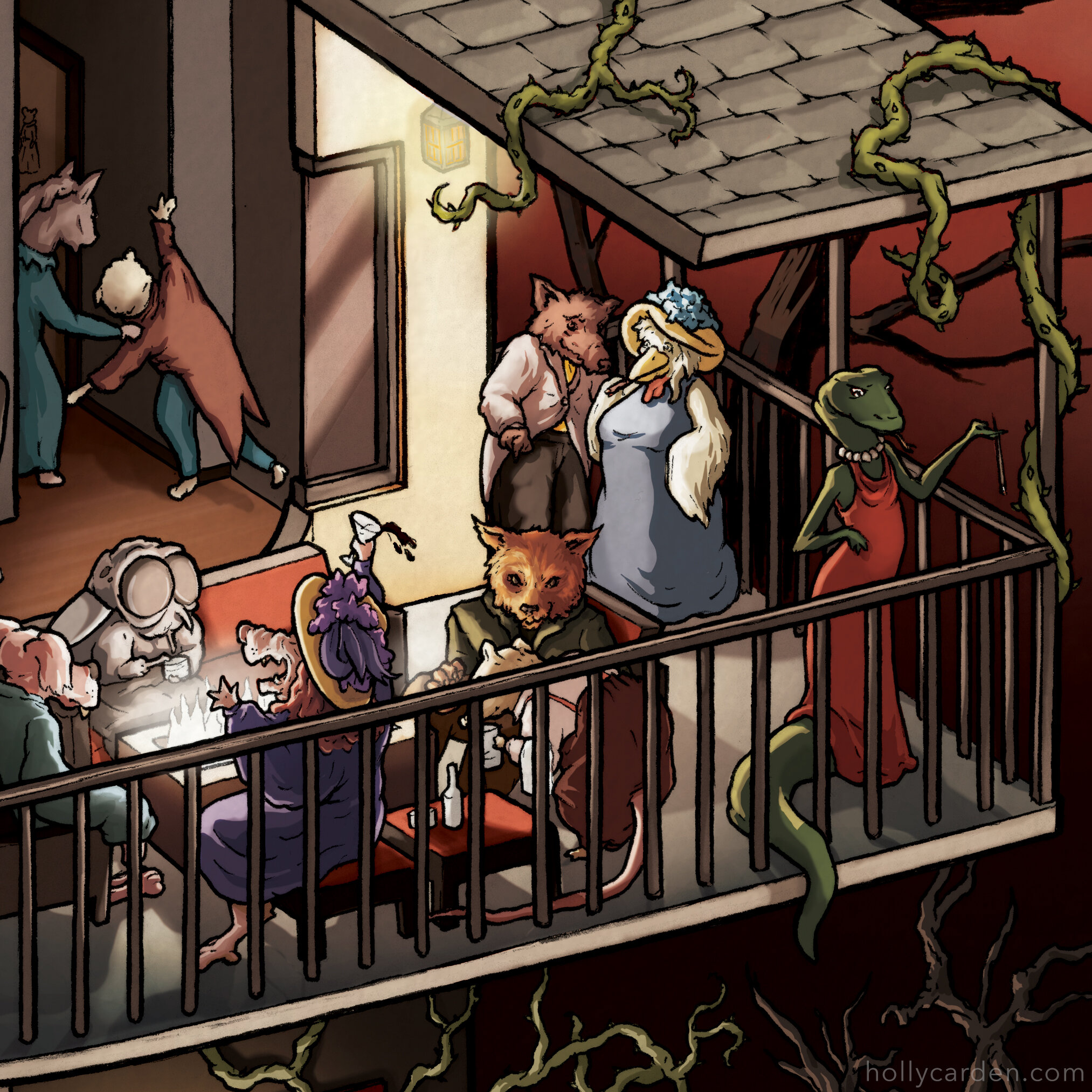
Making the Fable Lounge Cutaway
/Last year the gorgeous Fable Lounge opened in Nashville, TN. After seeing my mural and design work for Nashville Urban Winery, Fable co-owners Ben and John reached out and commissioned a storybook-inspired map of the city to hang in their lobby (which was a fun excuse to draw in pencil for the first time in years!) The beautiful layout and interior design of the lounge made for a perfect cutaway subject, so we decided to make this playful illustration showcasing the theme and aesthetic. The scene is packed with vignettes of fable characters involved in their own little dramas while enjoying the luxurious environment of Fable Lounge. Scroll down to see the making-of process, rough sketches, and details from the illustration.

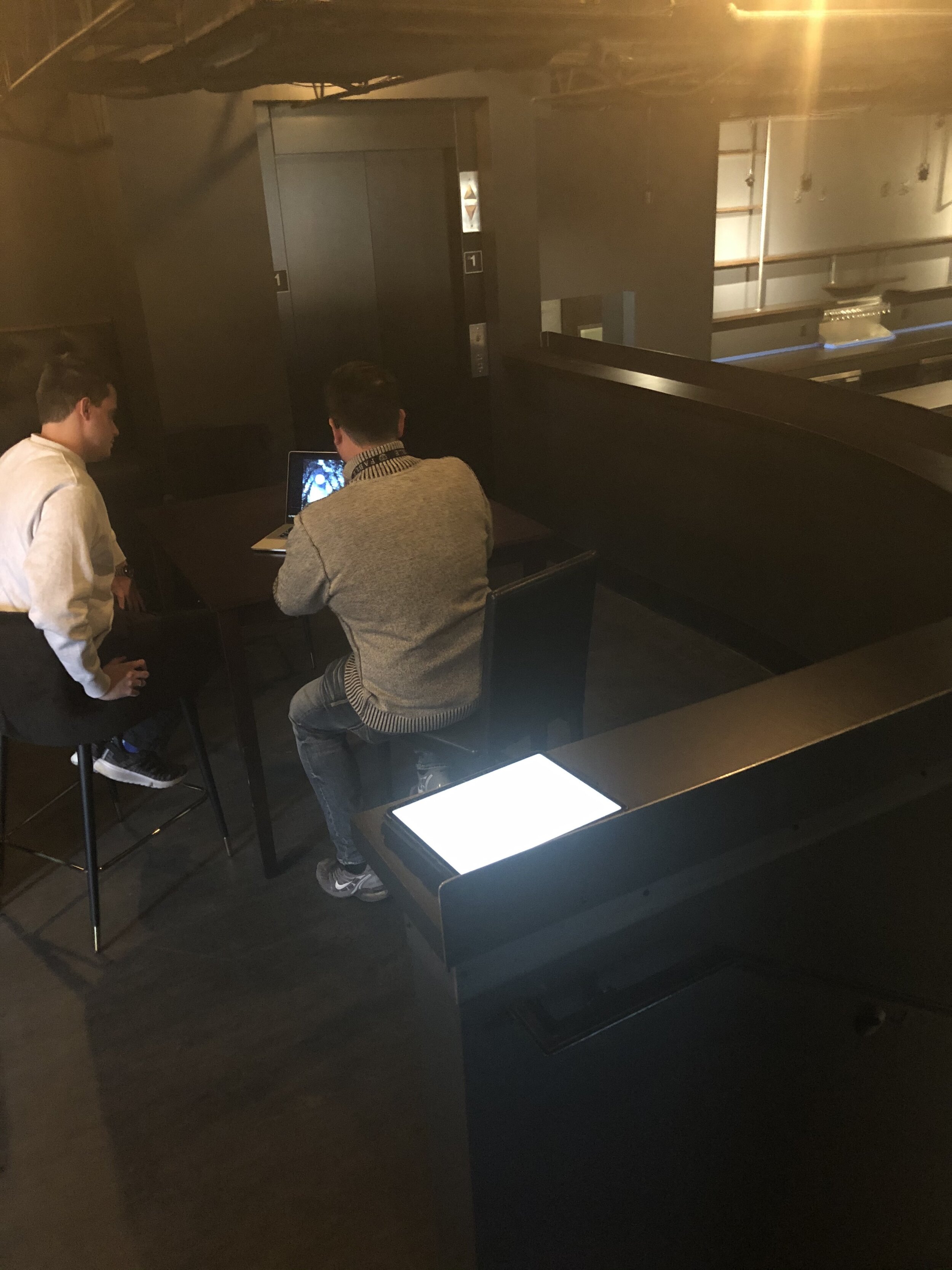
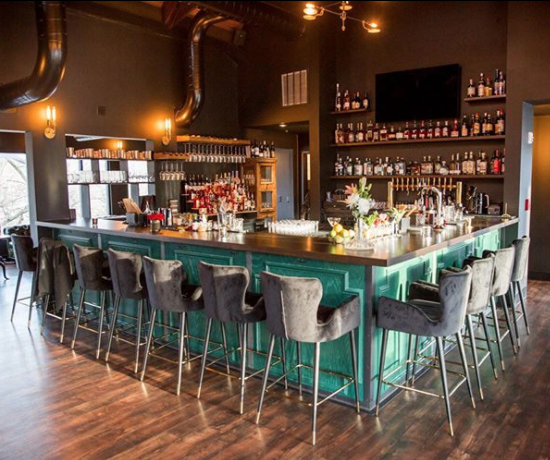
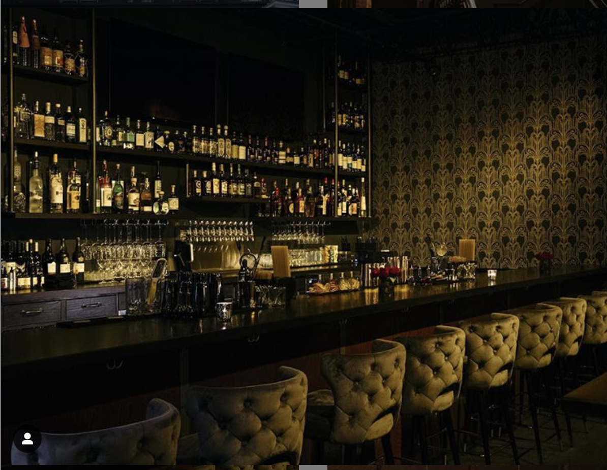
The first step was to translate the structure into a 3d sketch. I took a detailed tour of the building (including the very cool creepy attic space!) and took a ton of reference pictures. Ben & John also provided a wonderful style guide and all their original concept art for the bar.

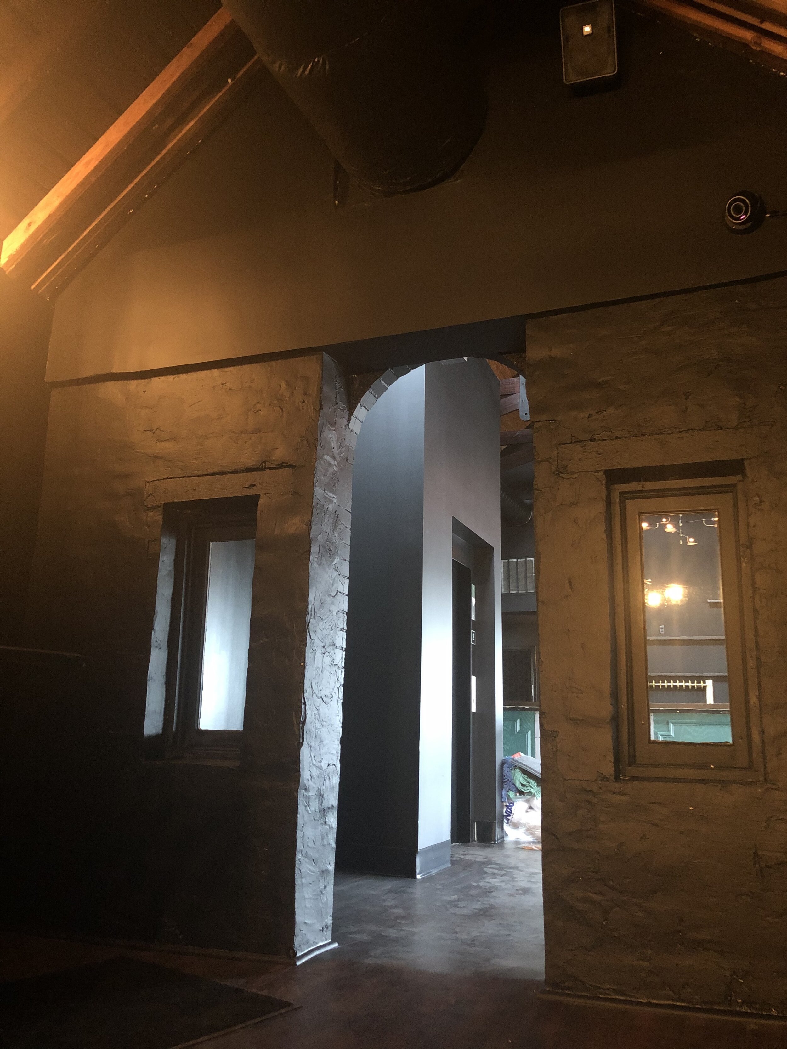
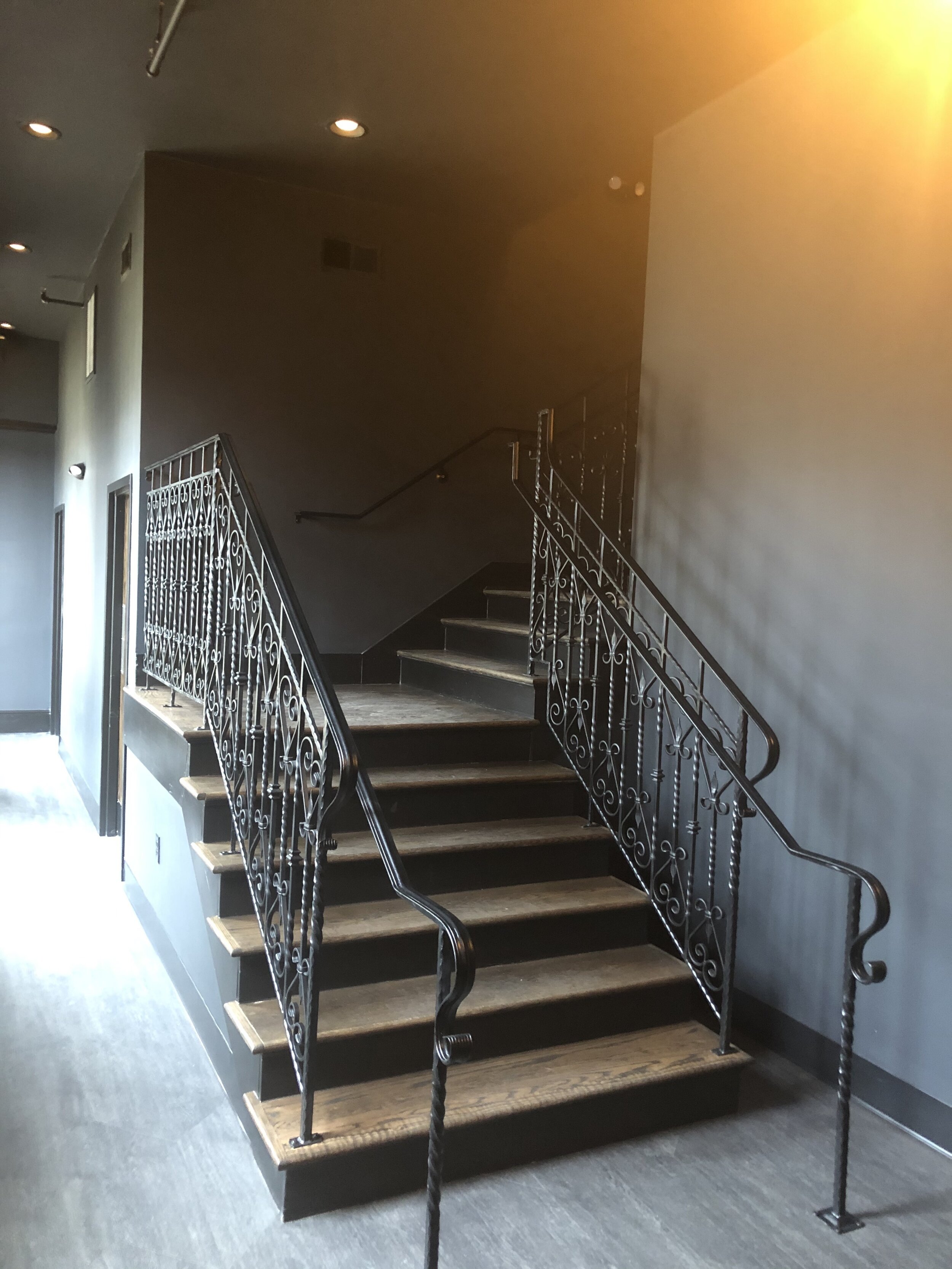
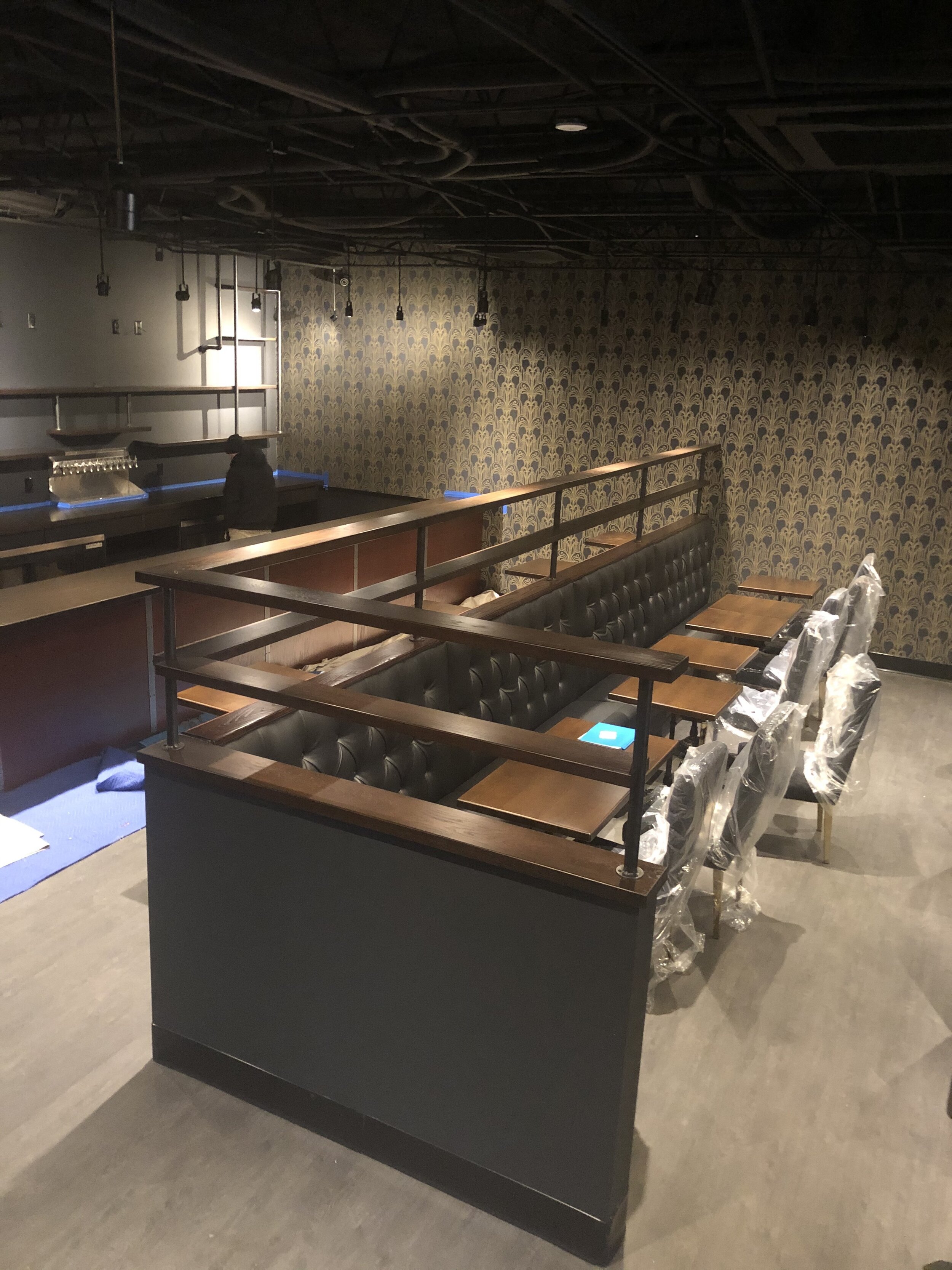
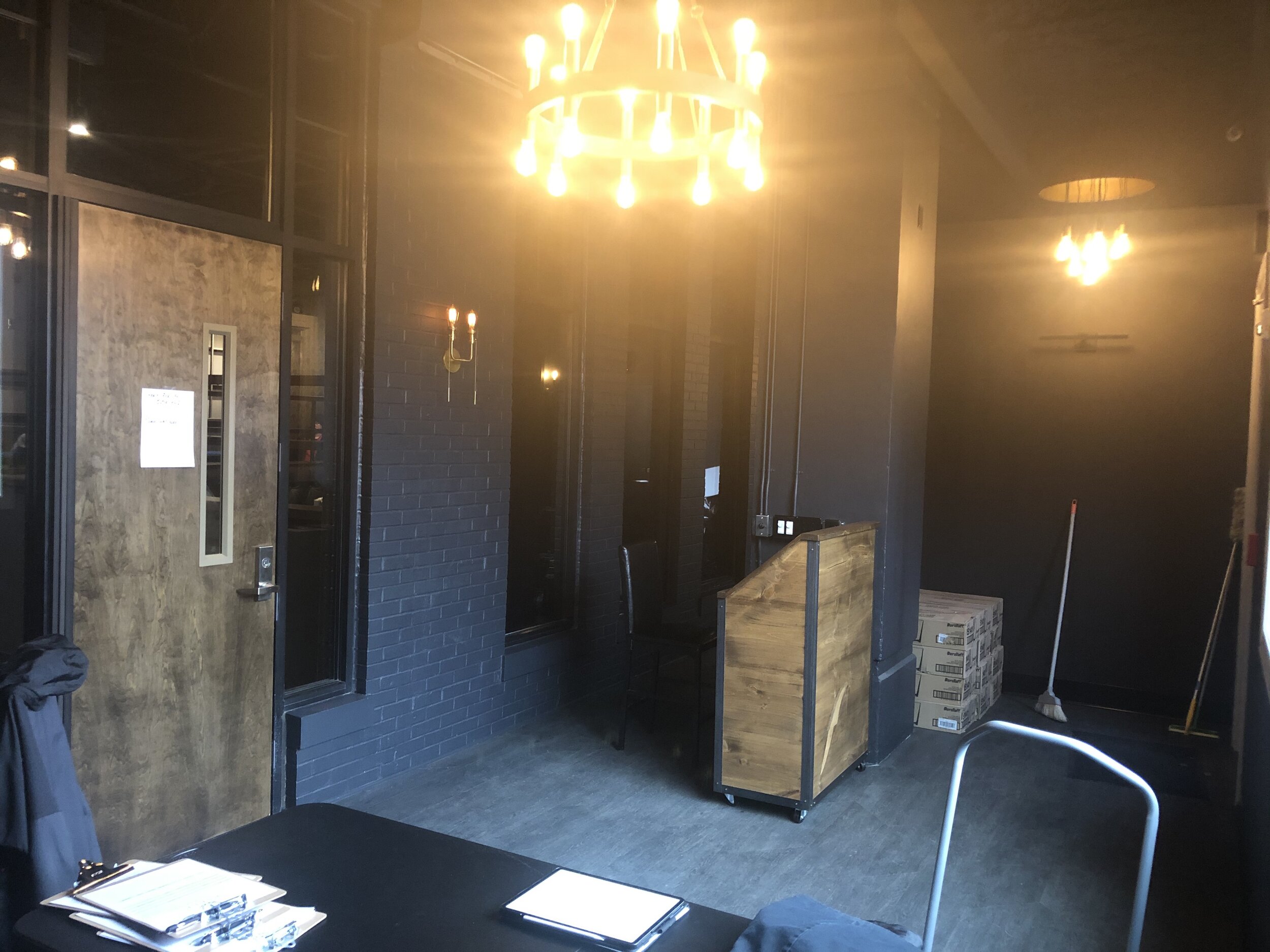
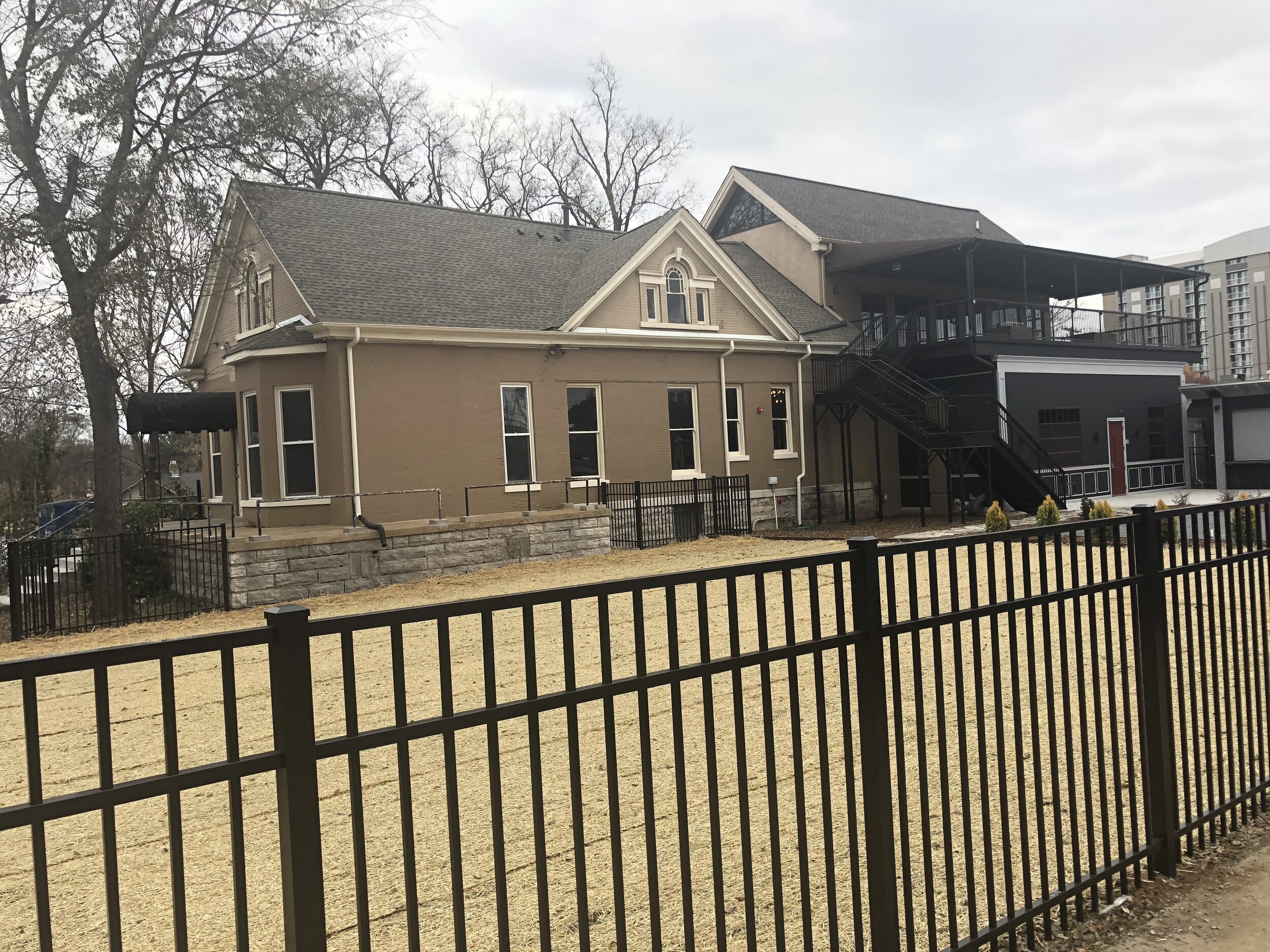
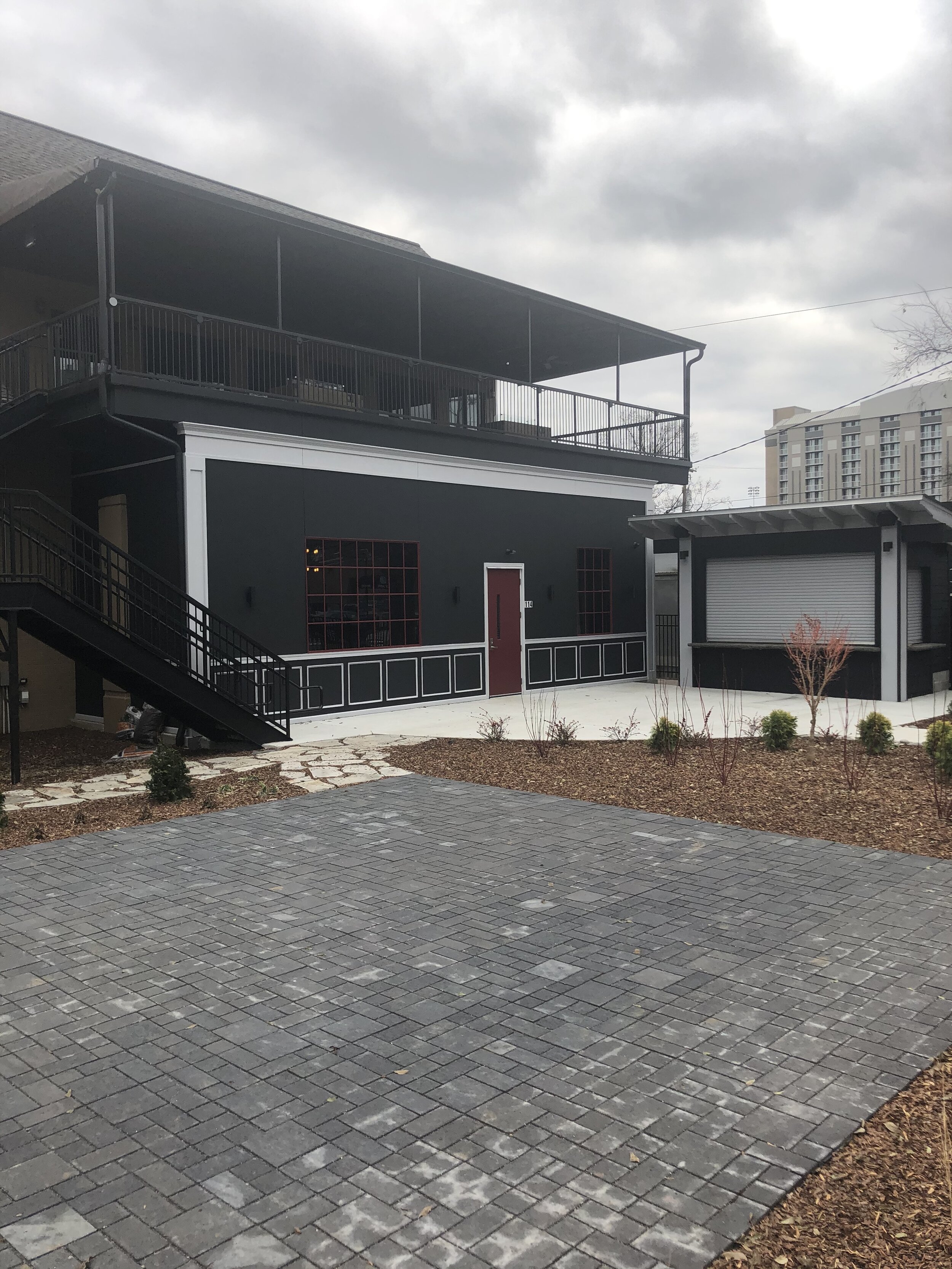
The lounge has so many beautiful details so deciding where to cut away was difficult. However, the overall composition of the image takes precedence here, and this angle offered the most interesting and comprehensive view of the lounge.

The stairs and elevator served as a nice axis for the image, and all main areas of the building are visible. I later discovered this angle also offered a way to incorporate the logo into the drawing by including the sign outside. As the sketches evolved, the cutaway structure didn’t deviate too much from the original draft.
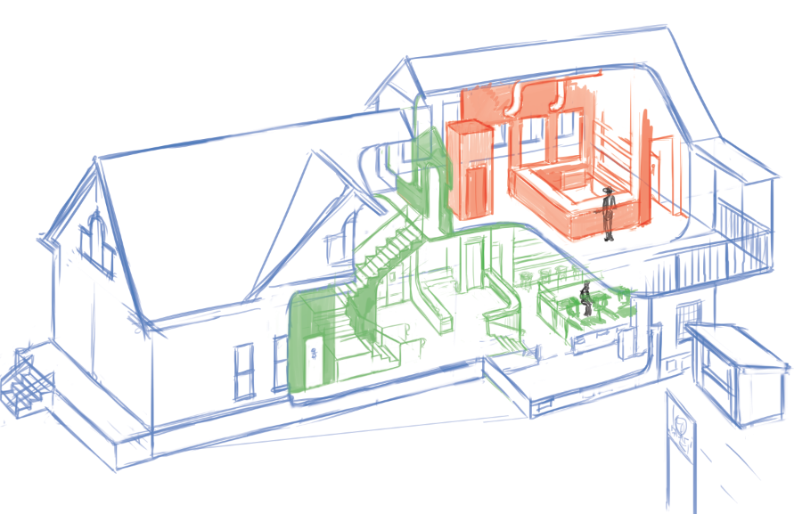

There was, however, one huge deviation. Initially the drawing was to be a portrait of the building with no plan for characters. When the tight sketch was complete, the idea of adding characters was presented, one thing led to another and, well… the Wimmelbild was unleashed!


I played with the style a bit before starting the final draft. I originally planned to do a rougher pen and ink style, but as the level of detail increased, a cleaner linework was necessary to help differentiate layers of depth and avoid a muddy mess.
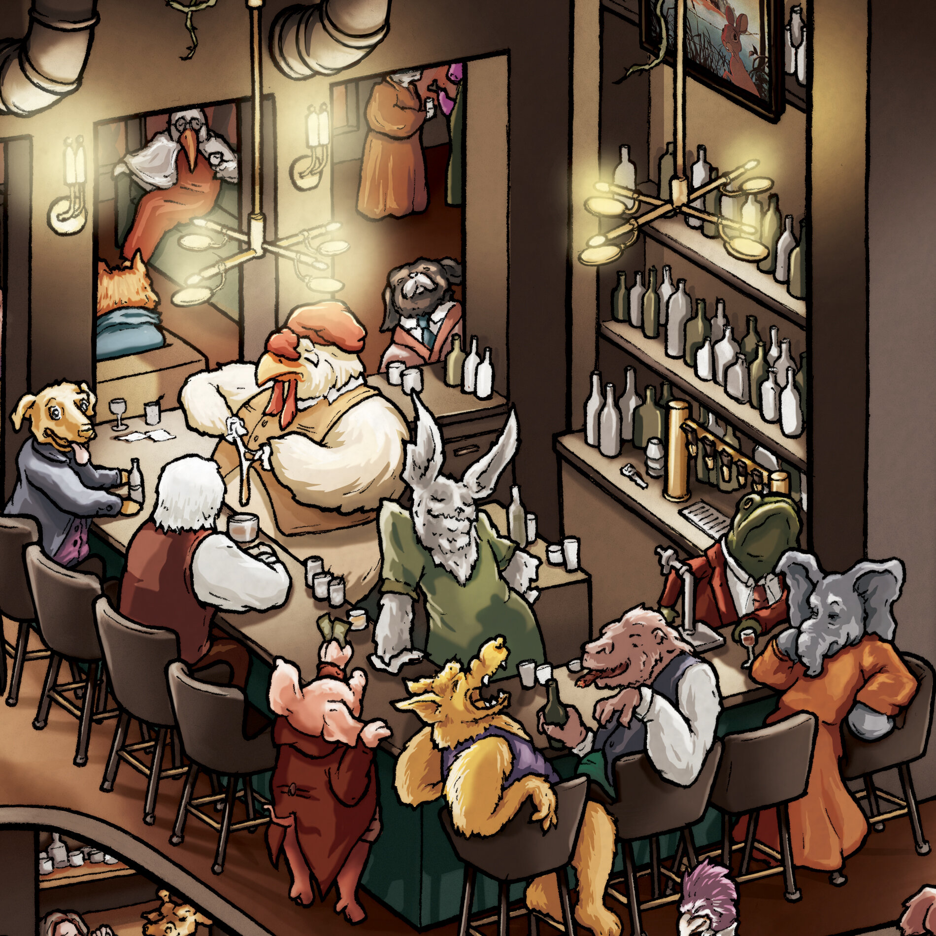
My characters are inspired by classic fable and fairytale illustrations. I actually hid a couple of characters from the references in the picture.

Wilhelm Anton Wellner (1859-1939), ‘Die Vivisection des Menschen’ (The Vivisection of Man), “Lustige Blätter”, #1, 1899

The next step is to print the rough draft at a low opacity and ink the drawing by hand. If you’ve read my other making-of blogs you know this is my favorite part. I use .005 and .01 Micron pens on Bristol, and I correct mistakes with Dr. PH Martins white and a teeny tiny brush. I wear cotton gloves while I work to avoid smudging and to keep any oil off the paper.
One way this cutaway is different from the Holmes and Poe cutaways is the scale; the figures in this illustration are much larger. This made drawing the characters more fun as it allowed me to draw more life into them through their expressions.
If you’d like to see some video of the inking process, check out the 🖋️ highlight reel on my instagram!


Once the linework was done, I scanned it and cleaned up the lines a bit. Now we are ready for color. I sourced a palette from pictures from the Fable Lounge’s instagram, attempting to match the colors as accurately as possible. (Note: at this point I still have not the slightest idea what to do with the background…)
Next I began the arduous process of filling in all the flat color. It’s pretty fun, although can get tedious at times. I am always pretty careful to keep my layers organized and labeled. This illustration ended up with 244 layers in 8 groups (I’m perhaps overly cautious when it comes to merging…)
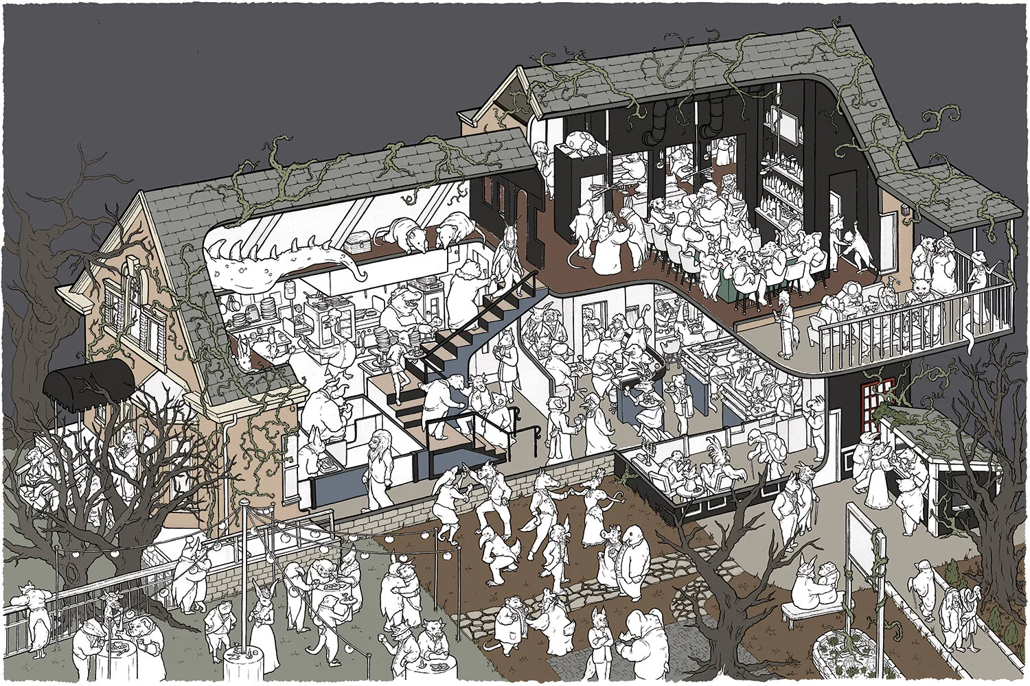

Due to the larger scale, lighting Fable was more complicated than Holmes and Poe. I confess I haven’t done anywhere near enough light study as I should have, especially to be tackling lighting projects like this, so there’s an awful lot of eyeballing and guessing going on here. I began lighting the image in the garden party because it seemed like the easiest place to figure out how to go about doing it. It’s a mix of hard cell shading and soft adjustment layers; not entirely consistent throughout the picture but it ended up looking pretty cool all the same. The Fable Lounge’s lighting is super dramatic so I didn’t hold back when it came to brightness overlays.

I decided on a simple, classic, spooky tree sky. Below is the flat color, a layer of cell shading, the basic wall and floor shading, and an overlay of the main lights.

Here is the final again, with layers of more detailed bright lights and shadowed areas. I also gave it a warmish hue to suit the coziness of Fable Lounge. It was a really enjoyable project, and Ben & John couldn’t have been more awesome clients. Fable really is a wonderful place. They care so much about providing quality food and a unique experience. Check out the details below and if you’re passing through Nashville, pay them a visit!

Thanks for reading! Please comment below with any questions. Prints and coloring posters available in the store!

